Creating and editing Layouts
This document describes how a developer can create and edit Layouts in the App Builder.
Introduction
When developing an application in the App Builder, you use Layouts and Components to build your pages.
A Layout is a reusable container to arrange components on the Page Canvas. The App Builder has a few different Layouts, such as Authenticated and Empty. You can also create custom layouts.
A Component is a specific functionality you add to your layout or page. The App Builder has numerous pre-built components, such as Menu, Header, Table, Date Picker, Icon, and Breadcrumbs.
Every page in your application requires a layout. If you want a standard header, footer, and sidebar to appear on multiple pages in your application, you can create this as a layout and then use it on various pages.
Working with Layouts
Working on a layout is almost the same as working on a page, except for View components. A View component tells the application where in your layout to render pages.
How to create Layouts
We'll create a small example to demonstrate how to work with layouts.
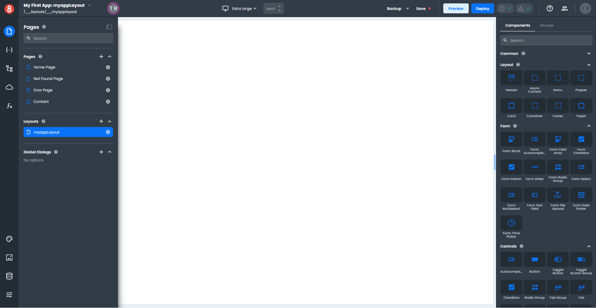
Click the Pages icon on the left-hand toolbar to display the Pages pane.
To create a new layout, click the "+" next to the Layout name in the Pages pane, and a fly-out panel will open. Enter the name of your layout and click "Save".
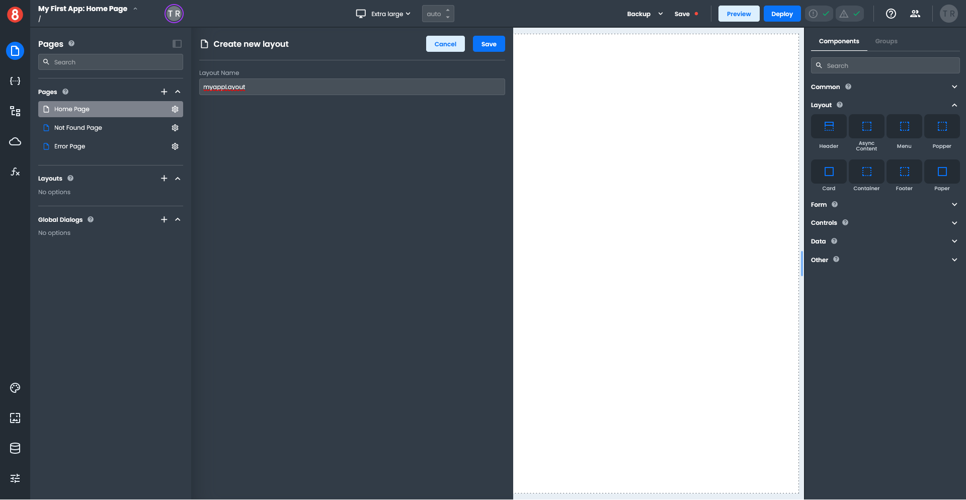
The App Builder saves your new layout, collapses the Pages pane, and expands the size of your canvas. The name of your new layout appears in the upper left corner of your canvas.
Adding Components to a Layout
You can add components to your Layout by dragging them onto your canvas from the right-hand Components pane.
The right-hand pane is context-sensitive and will switch depending on whether you are working with a Layout or a Component.
Drag a Container component onto the canvas and enter "menuContainer" in the field above the components pane.
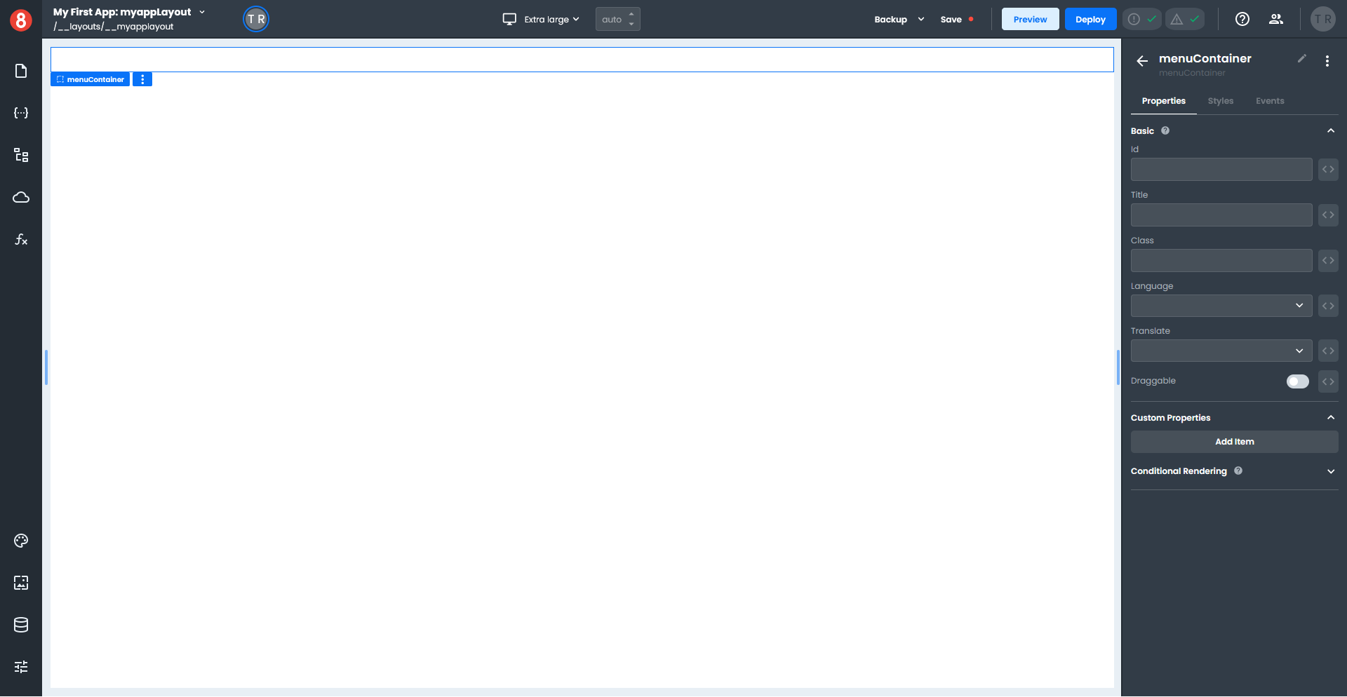
Click on the canvas to select the Layout; the name will be highlighted in blue, indicating it's selected.
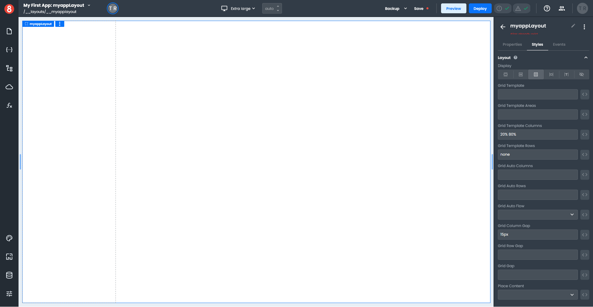
Click on the Grid icon in the Layout section on the Styles pane and enter the following. Grid Template Columns: 20% 80%, Grid Template Rows: none, Grid Column Gap: 15px.
Click in the left column on the canvas to select the menuContainer, and set a Background color in the Styles pane.
Click the arrow next to the menuContainer name to switch the right-hand pane back to the Components pane.
In the Search, type "list" to display all the List components.
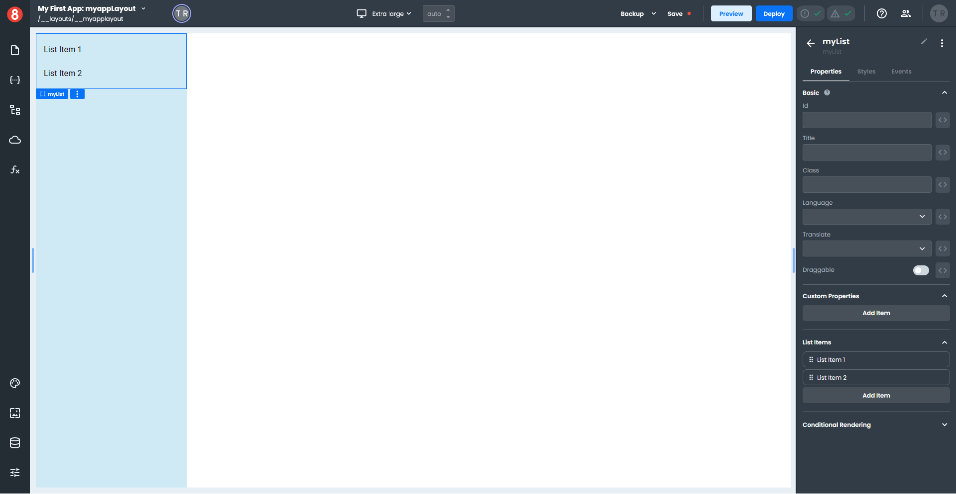
Drag a List component onto the left-hand column of the canvas, which creates a list with two List Items; this is your menu. Give your list a name, then click the arrow next to the list name to switch back to the Components pane.
Drag a View component (orange button) onto the empty area of the canvas; this is where your pages will display. (If your View component accidentally ends up on the left side of the canvas, just drag it to the right to reposition it.)

Click the Page icon in the left-hand toolbar to switch from Layouts to Pages.
Click on the Home Page item to load the page onto the canvas.
Locate the Heading component under the Common section of the Components pane, and drag it onto the canvas.
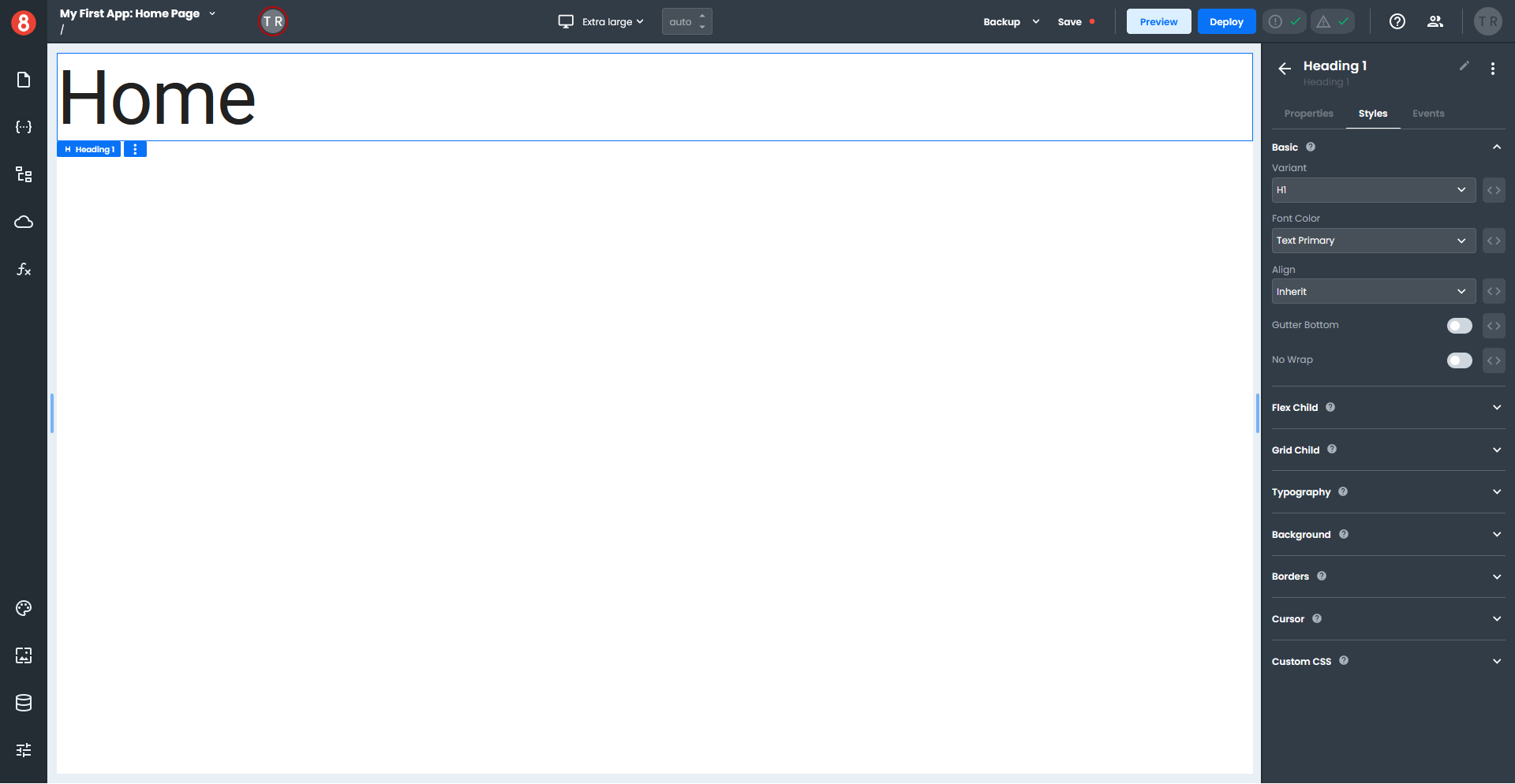
In the Properties menu under the Basic section of the Components pane, enter "Home" in the Text field. Click the Styles tab and set the Variant to H1.
Adding a Layout to a page
Continuing our example, we must set up the Home Page to use a layout.
Click the Pages icon on the left-hand toolbar, then click on the Gear icon on the Home Page item.

In the Page Settings panel under Page Layout, select your layout from the Layout drop-down, and click "Save". (Only layouts in your App that have a View component are displayed in this list.)
If you return to the Home Page, your layout will display the page.
Adding data to a Layout
A Layout can access Data. More specifically, it can access Routes for the page.
Click the Pages icon on the left-hand toolbar and select your Layout to switch to the Layout view. Then click the State icon, which opens the State panel, and click the Global tab.
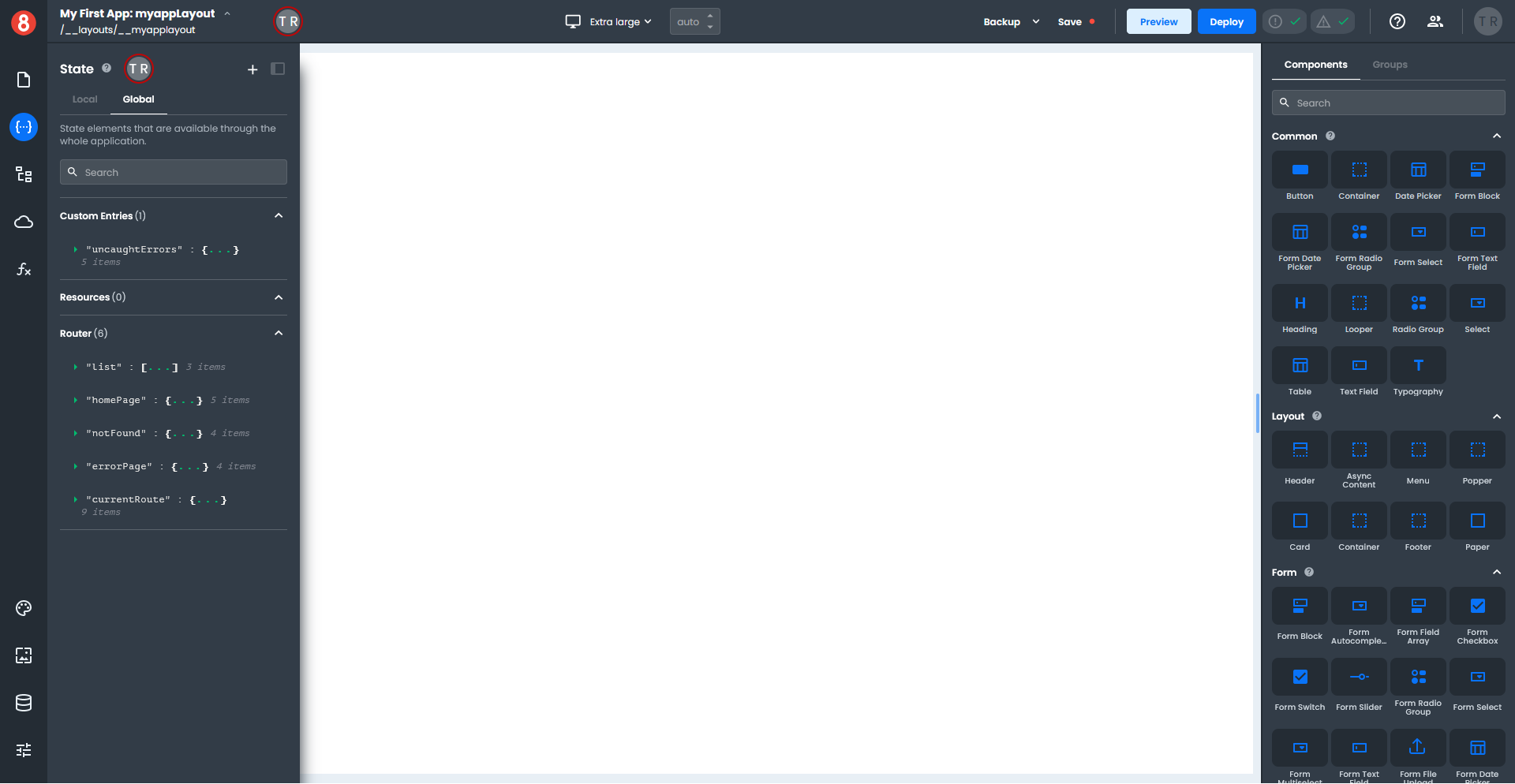
Under the Router section, click on the small green arrow next to the "currentRoute" name to see a list of attributes.
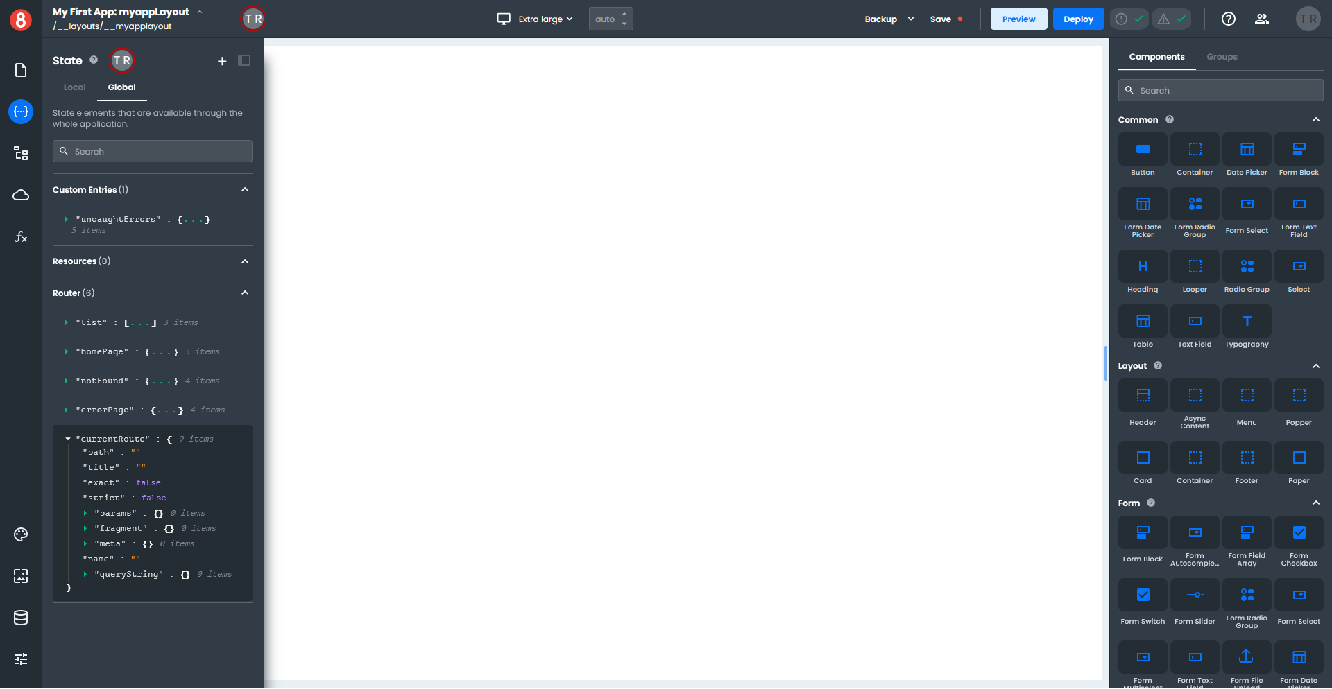
Hover to the right of the "path" attribute, which will display a clipboard icon. Click on the icon to copy the path to the clipboard.
Click on the State icon to collapse the State panel and return to the Layout view.
Select the first List Item in the left column and click on the Properties tab in the right-hand pane. In the Basic section, paste the copied "path" attribute into the Text field. Add two brace brackets to the start and end of the "path" attribute.
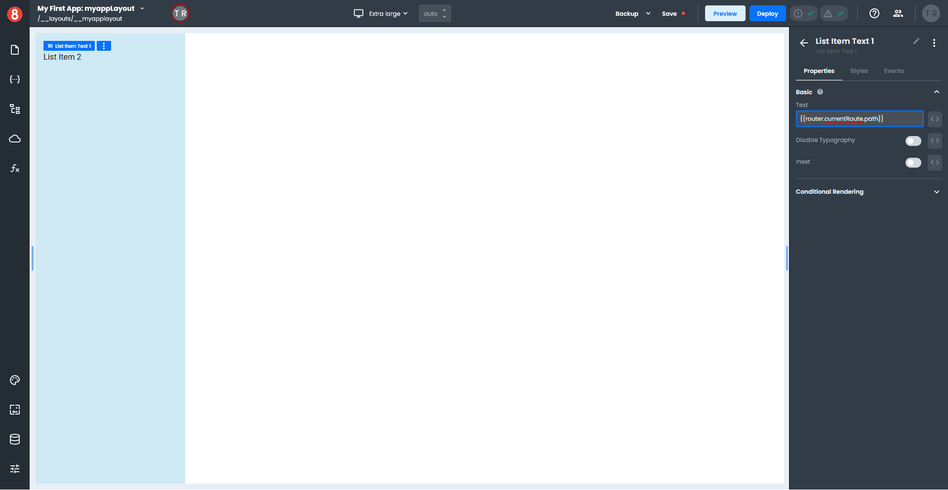
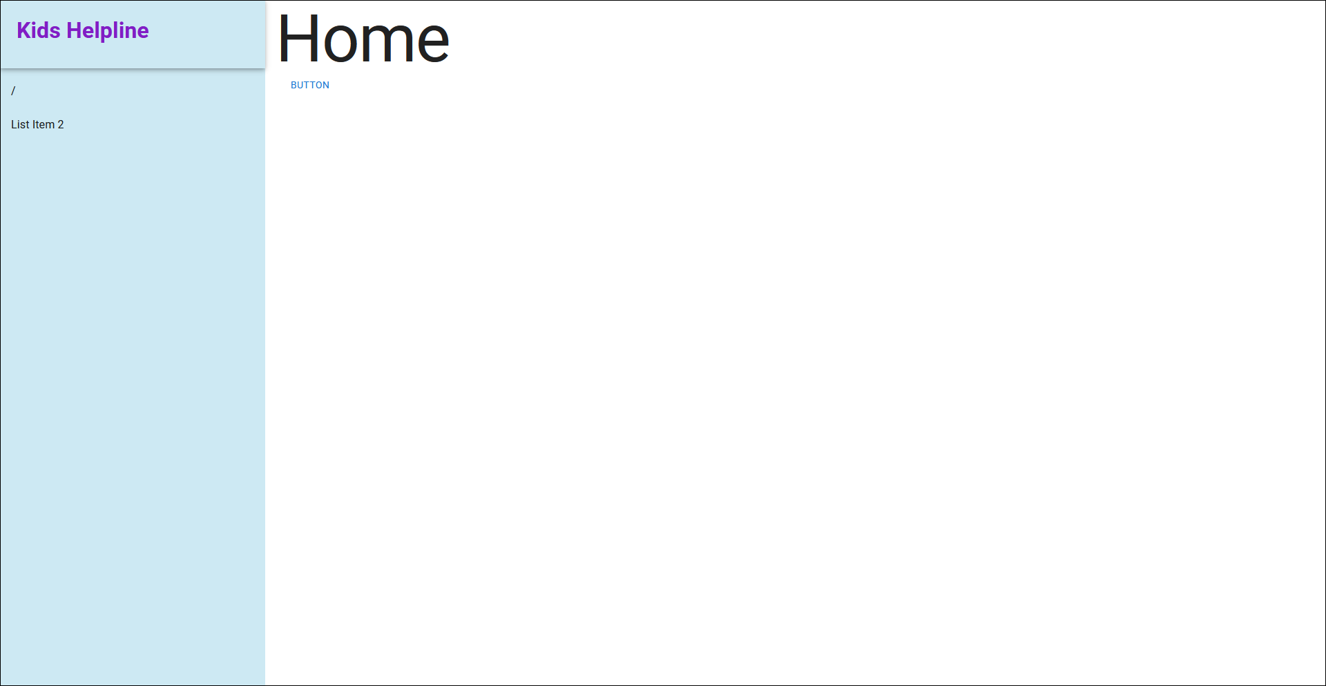
The first List Item will not display anything in the Layout view, but if you switch to the Page view and select your Home Page, you will see the "path" displayed in your menu as a forward slash.

Click on the Page icon to return to the list of pages, then click on the Gear icon next to the Contact page; set the Layout to your current layout.
If you still need to created a Contact page, do that now.
Testing a Layout
Let's add some navigation so we can test the layout.
Click on the Page icon and select the Home Page. In the Components pane, search for "button" and drag a Button component onto your page.
Select your page's Button component and click the Styles tab in the right-hand pane. Set your button's Size to a Width of 100 and a Height of 25.
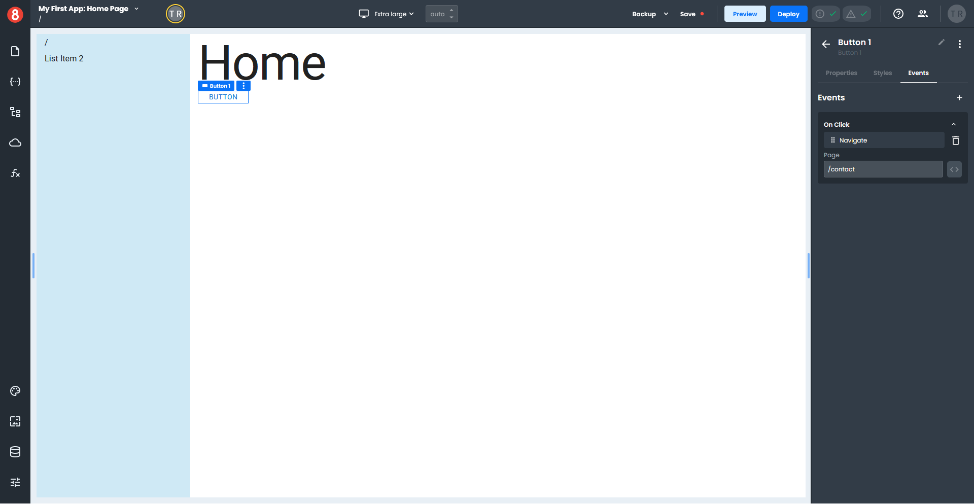
Click the Events tab in the right-hand pane and then click the "+" to add an event and select the On Click event.
Click "Choose Action" and select Navigate from the drop-down menu. Enter "/contact" as the path in the Page field.
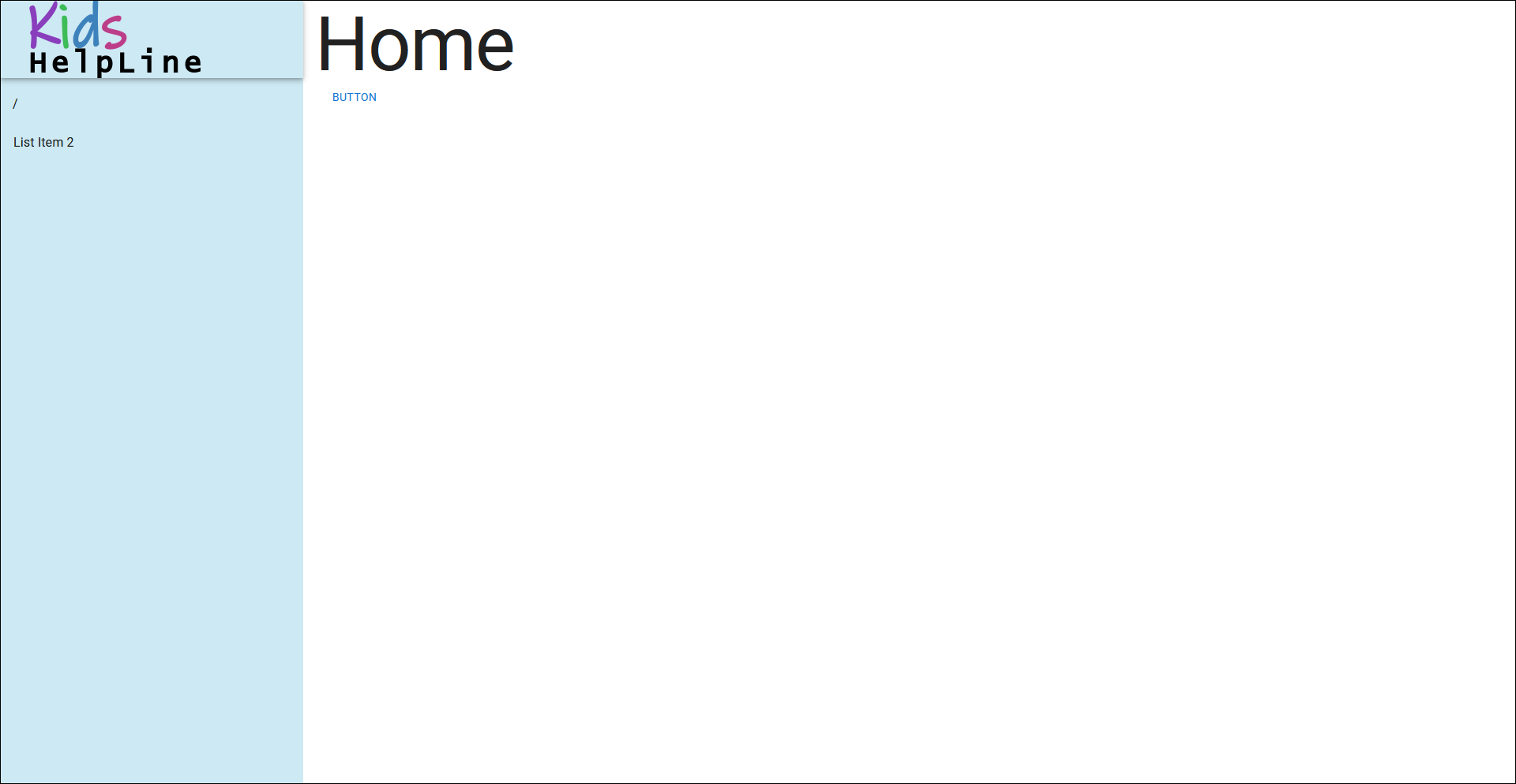
To preview the Home Page in a web browser, click the Preview button in the top toolbar, which opens the page in a new browser tab.
Click the Button on the Home Page, which takes you to the Contact page. Notice the path for the Contact page displays in the menu.
Finishing up
A Layout can access global objects like the router to access information within the page, which helps to create the dynamic aspects of your application.
How to edit Layouts
We will modify our existing Layout to demonstrate how you can edit layouts.
Click the Pages icon on the left-hand toolbar to display the Pages pane. In the Layout section, select the layout you want to modify, which loads the layout in the App Builder.
Adding a Header to a Layout
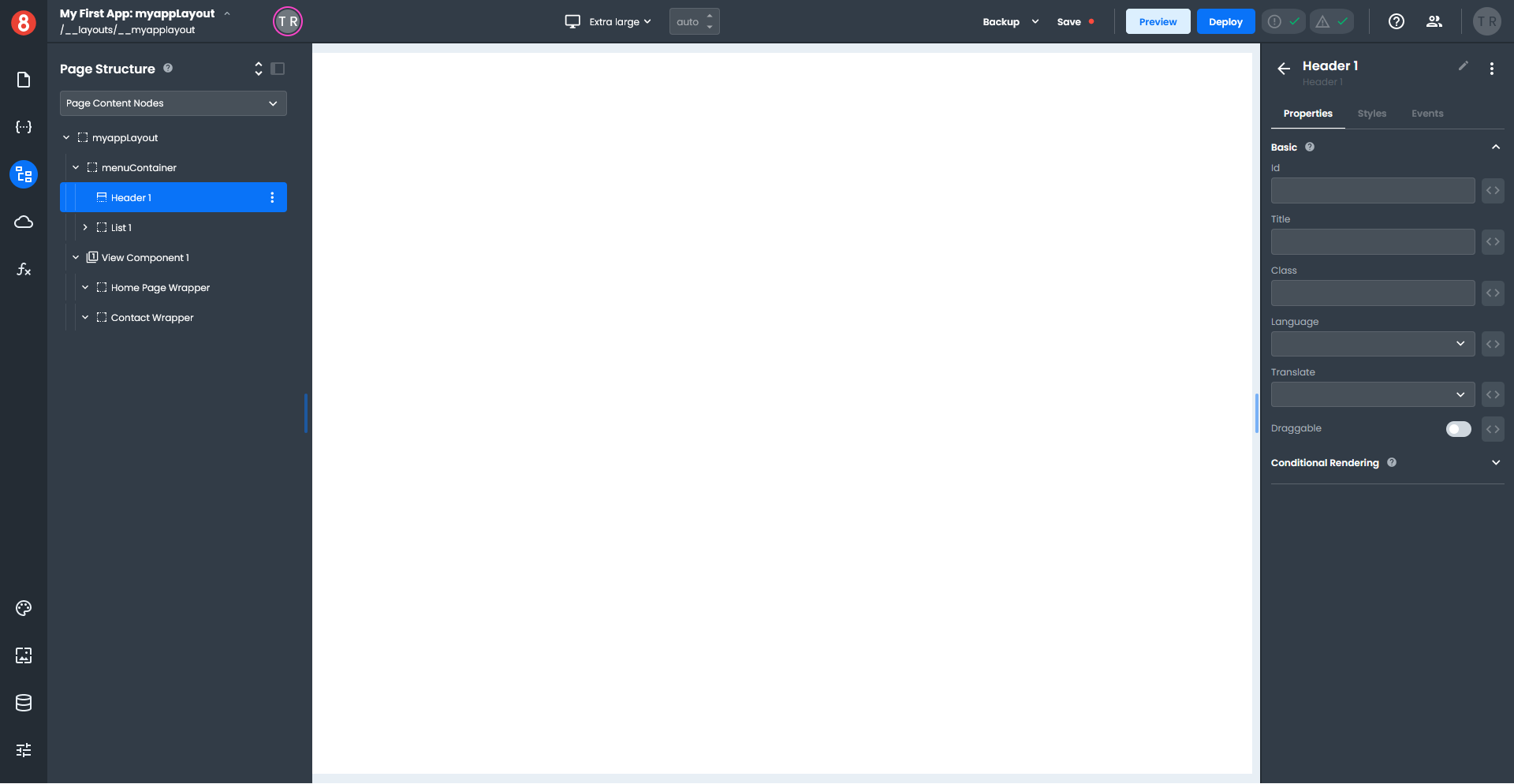
Select a "Header" component in the Layout section of the Components pane and drag it onto your menuContainer. It will likely end up at the bottom of your List, but we can change the position of it.
Click the Page Structure icon on the left-hand toolbar to display the Page Structure pane. The easiest way to move your Header is to select your List and drag it below the Header.
Click the Page Structure icon on the left-hand toolbar to close Page Structure pane.
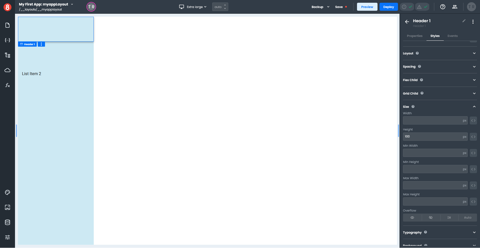
Select your Header and click the Styles tab in the right-hand pane. Set the Color to Transparent, so the background shows through your Header. Next, expand the Size section in the Styles pane and set the Height to 100px.
Click the arrow next to the Header name in the right-hand pane to return to the Components pane.
For this next part will show you two different options:
- Adding an image - we will add a small image to your header
- Adding text - we will add a text label to your header
Adding an image to a Header
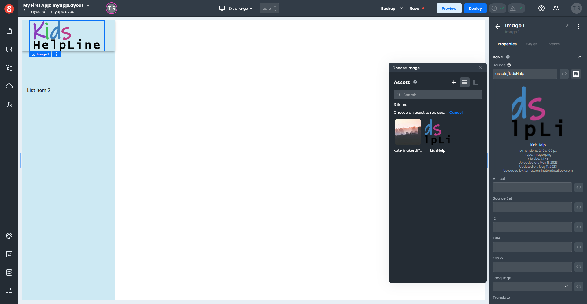
From the Other section of the Components pane, drag an Image component onto your header. On the Properties tab, click the image icon next to Source; this opens an Assets dialog window.
Click the "+" to open the Upload file dialog window, then select an image from your computer. Choose an image that is approximately 250px wide by 100px high.
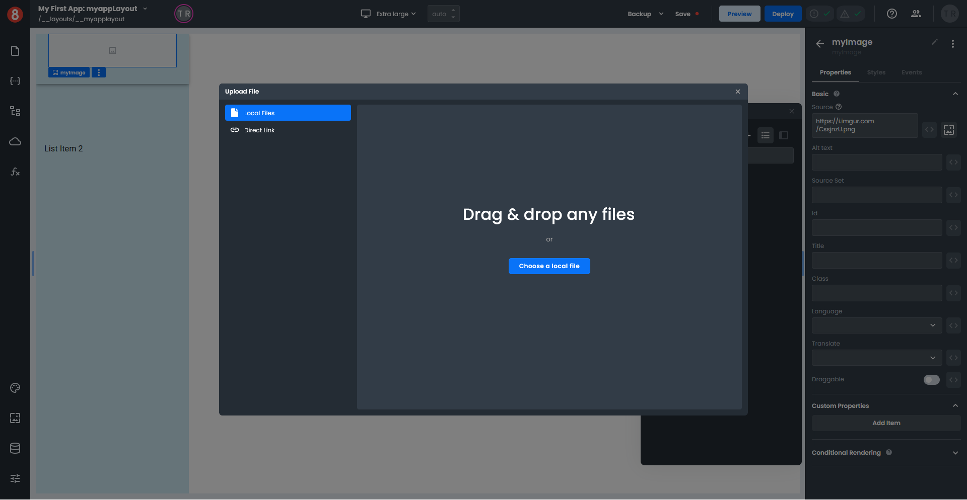
From the Assets window select the image you just uploaded; the image will appear in your Header. Click the "x" to close the Assets window, and add the image name in the Title and Alt Text fields on the Properties pane.
Previewing your Layout changes
Click the Pages icon on the left-hand toolbar to display the Pages pane and select Home Page in the Pages section. To preview your Layout changes, click the "Preview" button on the top toolbar; your Home Page loads in a new browser tab.
Adding text to a Header
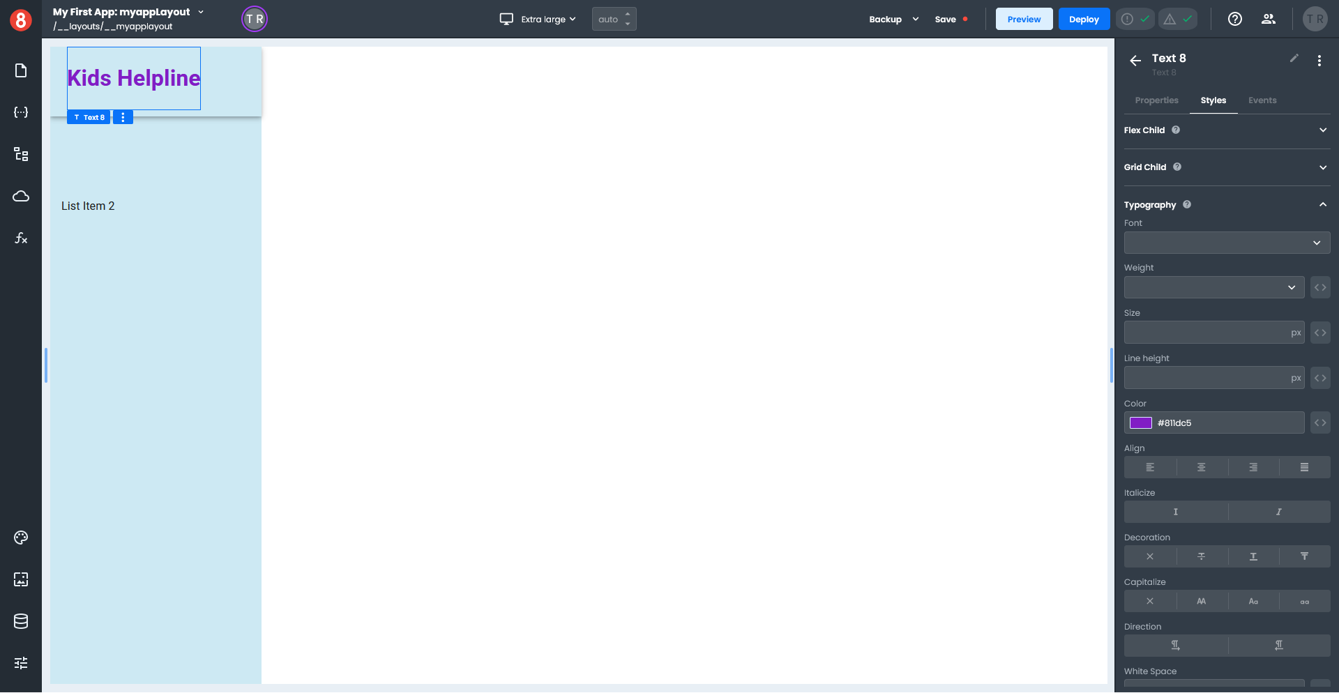
From the Other section of the components pane, drag a Text component onto your header. On the Properties pane in the Basic section where it says "Normal", select "Heading 1" in the drop-down, and where it says "Text", enter "Kids Helpline".
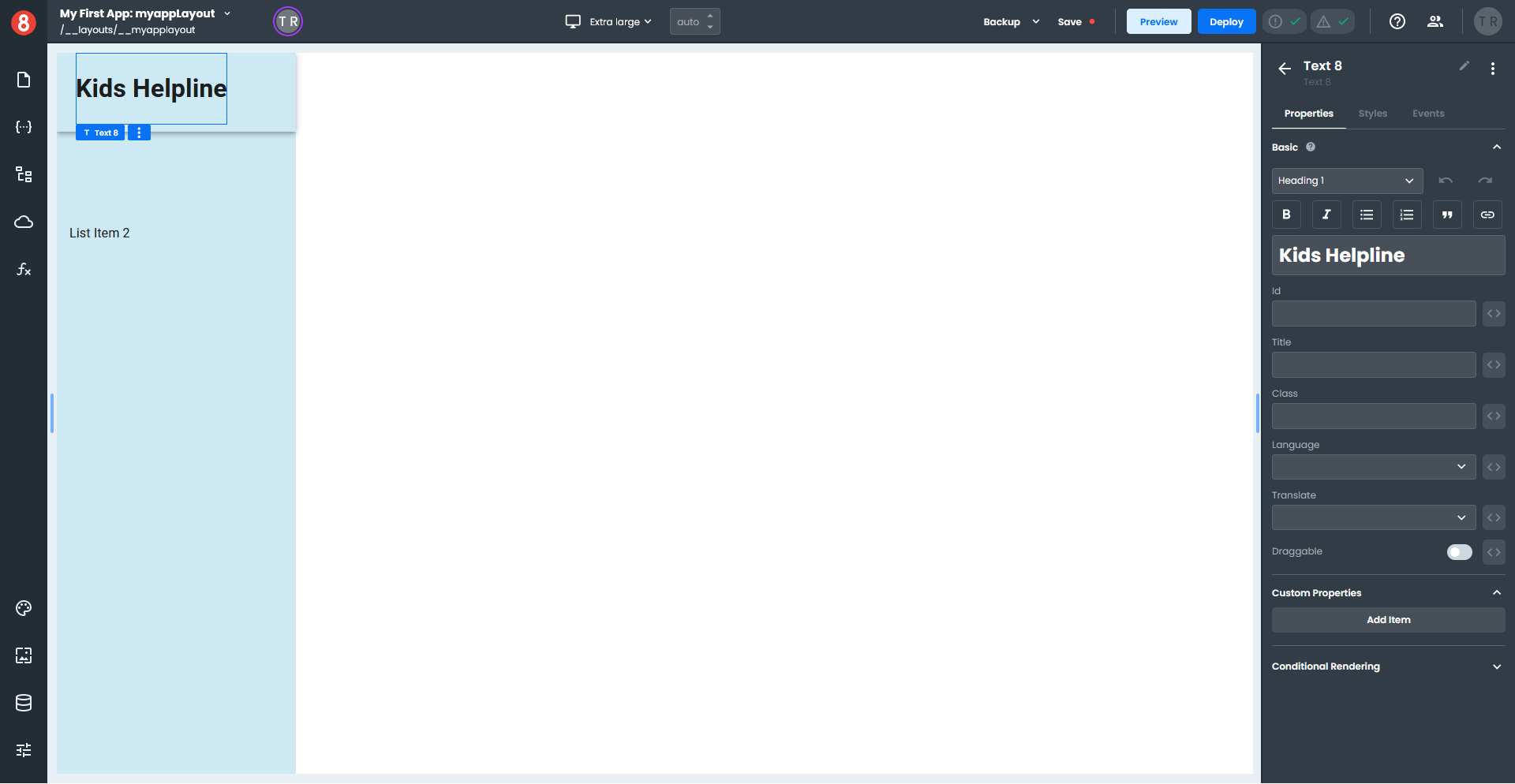
Select the Styles tab, expand the Typography section, and set the Color to Purple.
Previewing your Layout changes
Click the Pages icon on the left-hand toolbar to display the Pages pane and select Home Page in the Pages section. To preview your Layout changes, click the "Preview" button on the top toolbar; your Home Page loads in a new browser tab.
Remember that when you edit a Layout, any changes made will display immediately on all your pages that use that Layout.