Using Component Property Inputs
This article describes how a developer uses component properties when working with App Builder.

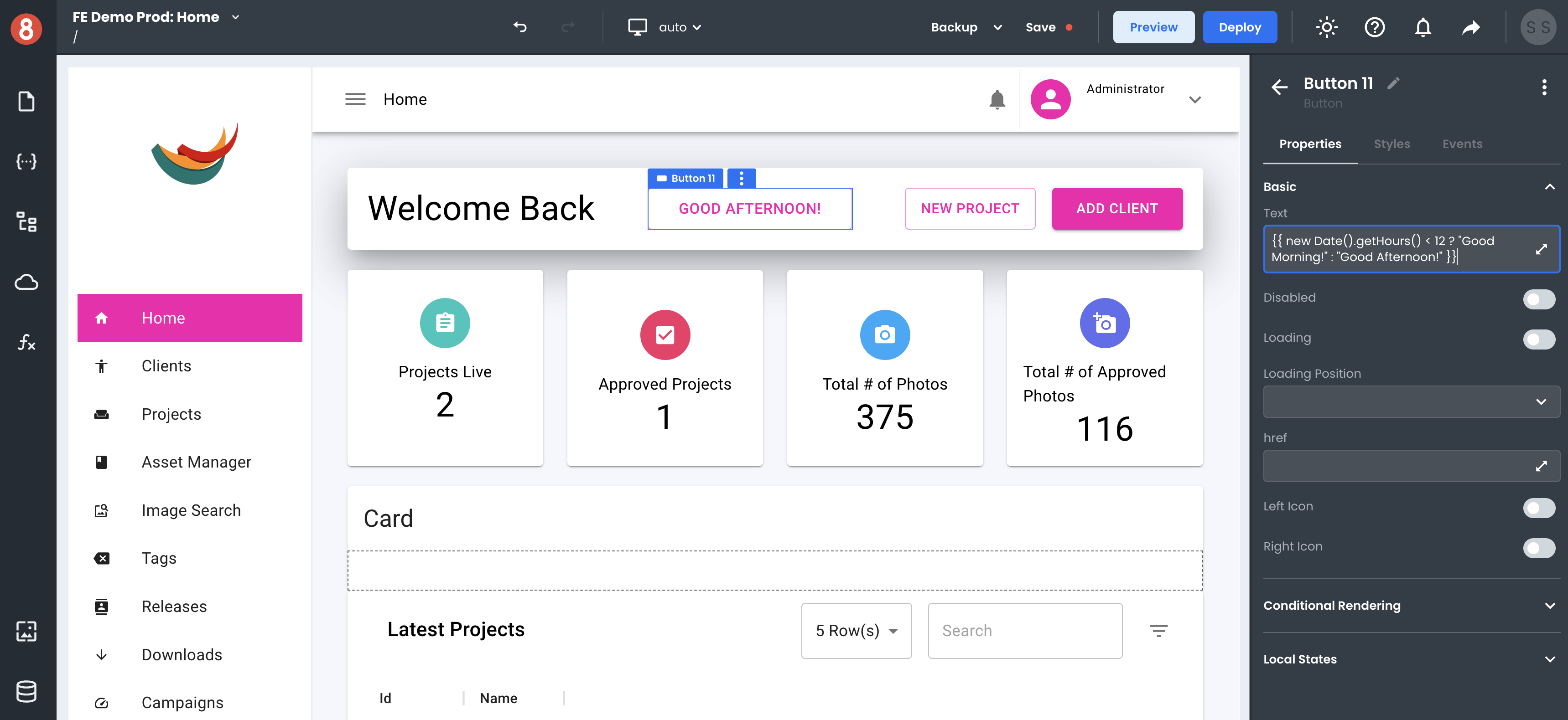
Every component in App Builder exposes many different properties inputs. Some of these properties are default, such as id or class, while others are unique to the component itself. Regardless of the property, all components share some everyday purposes: they accept static or dynamic values that will affect the behavior or data of the component.
Global Component Properties
The first set of properties that all components have are global properties. These inputs apply to every component and include things like id, class, and visible. These properties include:
• id - The name of the component. This name gets displayed in the Page Structure and the accessible State name of the component.
• title - The id of the component. This is the ID attribute value added to the parent element of the component.
• name - The native browser tooltip title value of the component.
• class - The class(es) of the component. This is the class attribute value added to the parent element of the component.
• show if - A dynamic value for whether the component is or isn't displayed on the Canvas (true/false).
• draggable - A dynamic value for whether the component is or isn't draggable (native draggable property).
• translate - A dynamic value for whether the component's text contents should or shouldn't be automatically translated by the browser.
• language - Allows for the setting of the language within a specific component container.
Global Input Component Properties
Components that are Input type components, like Textbox and Checkbox, have a few extra global properties. These inputs are:
• value - The initial/default value of the input.
• disabled - A dynamic value for whether the component is or isn't disabled (native disabled property).
• required - A dynamic value for whether the component is or isn't required (native required property).
• autocomplete - A dynamic value for whether the component is or isn't autocomplete (native autocomplete property).
• autofocus - Automatically focus the form control when the page is loaded.
• readonly - A dynamic value for whether the component is or isn't read-only (native read-only property).
Handlebars Enabled Inputs
Nearly all property inputs are handlebars enabled. This means that you can use handlebars expressions to dynamically set the value of a property based on other values in your app or data.
For example, you may want the value of a Textbox to be set to the value of an item in your app's data object. You would set the value property to {{ item.name }} to accomplish this.