Using and Validating Forms
Forms are essential for data collection, providing a structured method to gather user input.
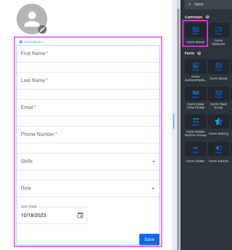
8base Frontends contains two essential items for using forms: The form block and form components.
Form Block
A form block is a container component, designed to house various form components or inputs. It is frequently used in scenarios requiring user input, such as sign-up forms or survey forms.
Form Components
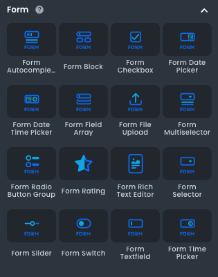
Form components are individual elements placed within a Form Block. They collect different types of user data and include:
- Form Autocomplete: is a normal text input enhanced by a panel of suggested options.
- Form Checkbox: Input that represents a selection.
- Form Date Picker: Input to capture dates.
- Form Date Time Picker: Input that captures date and time.
- Form Field Array: Displays form inputs based on a data array.
- Form File Upload: Input to upload multiple files.
- Form Multiselector: Input to select one or more from multiple options.
- Form Radio Button group: It selects a value from a set.
- Form Rating: Allows users to give feedback from a range of values.
- Form Rich Text Editor: Input that supports entering formatted text.
- Form Selector: Input that allows users to select an option from multiple values.
- Form Slider: Allows users to make selections from a range of values.
- Form Switch: Input to toggle the state of a setting on / off.
- Form Textfield: Input that captures text.
- Form Time Picker: Input to select a single time.
Use and Validations
Forms are used by triggering an On Submit event, which occurs when a user submits the form. The data collected from the form inputs is then processed and stored as needed. The initialValues property can be used for pre-filling specific fields in the form.
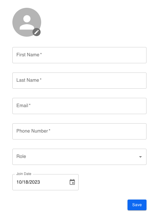
Let's build a simple page to create users in a database using the form components:
We will drag and drop a form block to the canvas, then add the following components inside it:
FormTextField
- Name: memberName
- Label: First Name
FormTextField
- Name: memberLastName
- Label: Last Name
FormTextField
- Name: memberPhone
- Label: Phone Number
Form Autocomplete
- Name: autocompleteRoleUserCreated Label: Role
Form Date Picker
- Name: memberJoin
- Label: Join Date
Submit Button
- Name: Save
It should look like this:
Validating the Form
Now, it's time to add validations to the form components we just added. This is facilitated by the Add Field Validation section present within the form block.
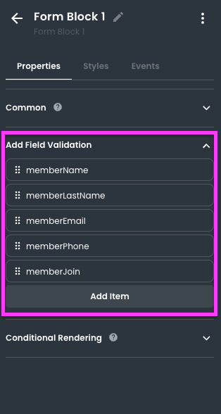
To add a validation, click Add Item. Each item will have a name field that must match the name of the form component to which we want to apply it.
For example, to apply required validation to the memberName field, the item should look like this:
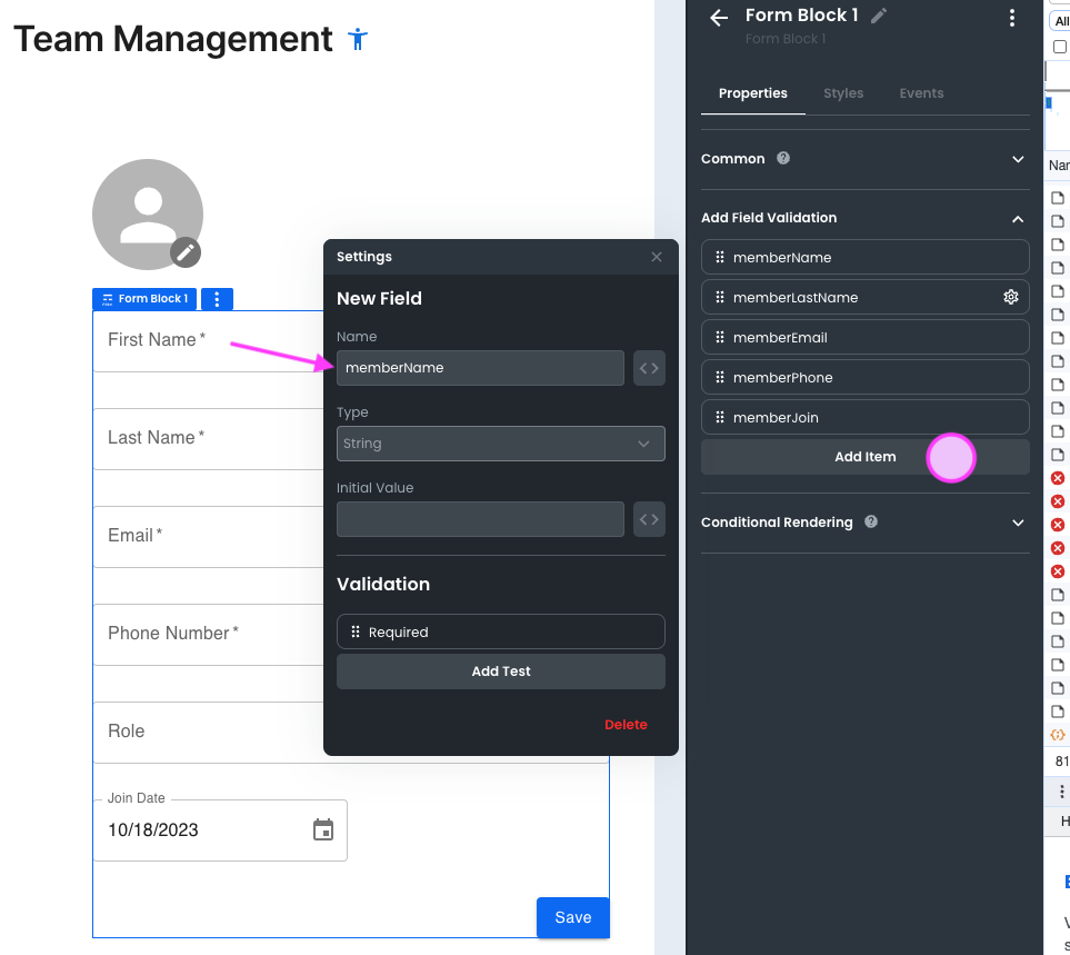
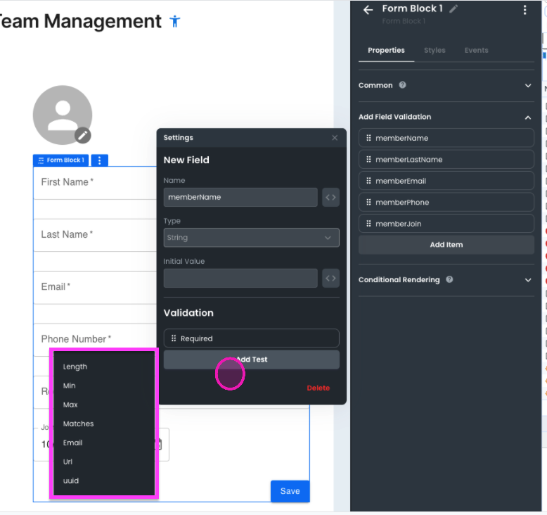
Once we create an item and match it with a field within the form, to add the desired validation, click on Add Test.
Depending on the field type, the available validations will be shown. In this case, for the String type, these are:
- Length
- Min
- Max
- Matches
- Url
- Uuid
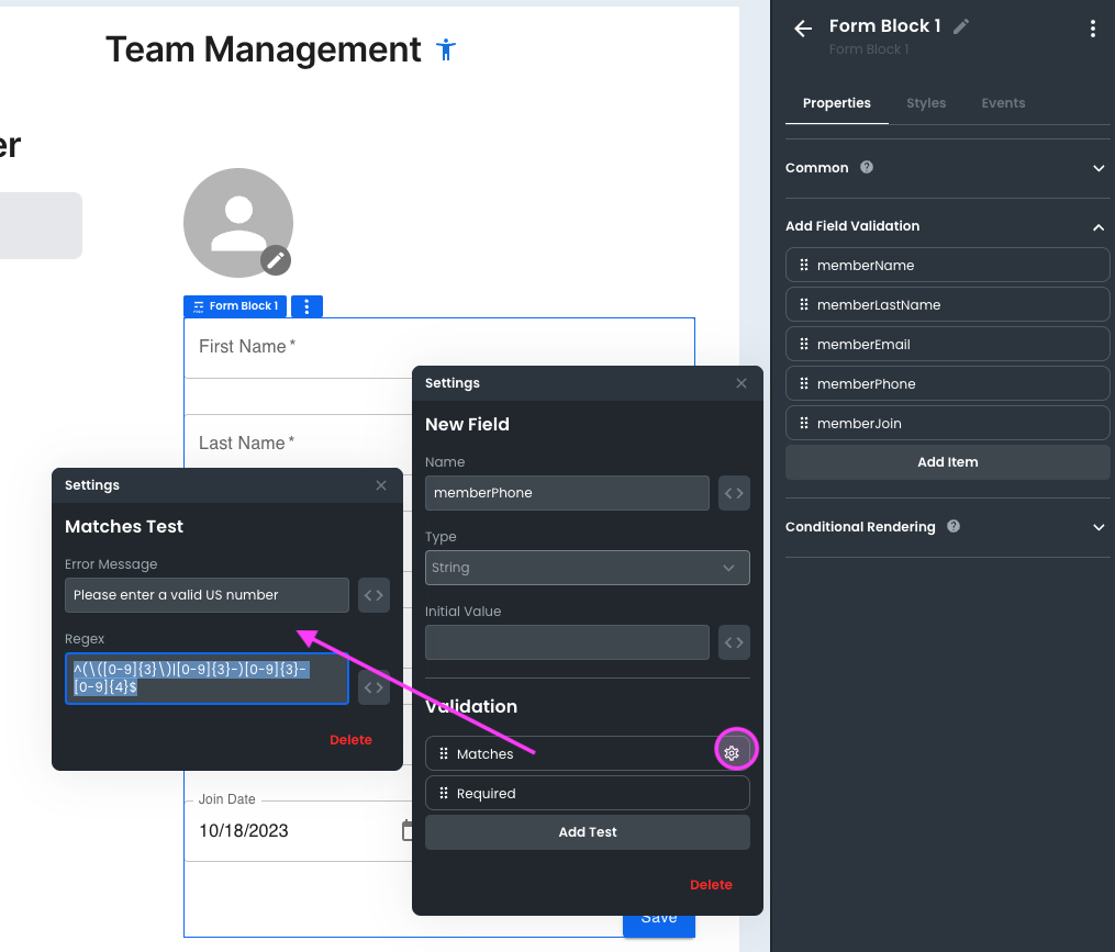
The form validations also allow us to add regular expressions. For example, for the memberPhone field, let’s add a regex to validate US phone numbers:
- Click on Add Item.
- Match the name with the field to which you want to add validation, in this case
memberPhone. - Under Type, select String.
- Click on Add Test.
- Select the Matches option.
- Click on the gear icon.
- Add an error message: "Please enter a valid US phone number."
- Fill the field with the necessary regex, in this case:
^(\([0-9]{3}\)|[0-9]{3}-)[0-9]{3}-[ 0-9]{4}$ ->This regular expression will only allow phone numbers with this format:(123)123-1234 - Click anywhere outside the dialog window to finish.
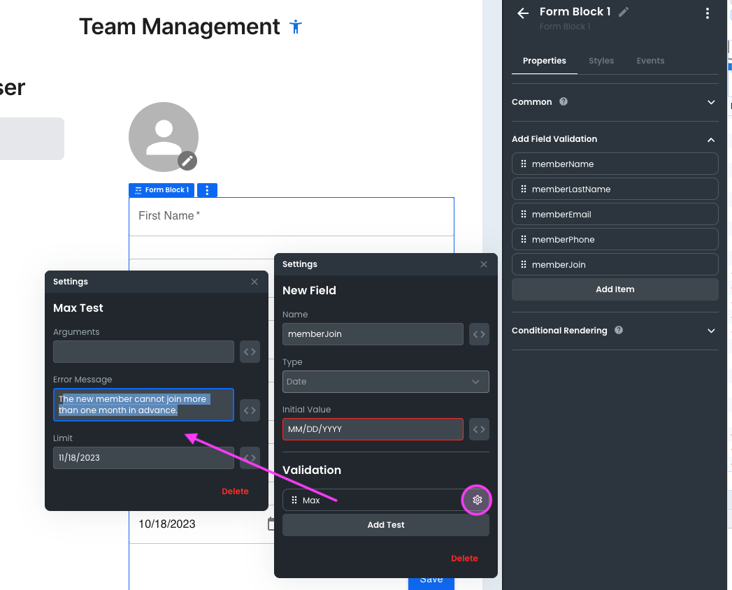
Next, let’s set up validation for a date type. Suppose we want to limit the user's date to join the team to a maximum of one month. Then we must do the following:
- Click on Add Item.
- Match the name with the field to which you want to add validation, in this case,
memberJoin. - Select Type Date.
- Click on Add Test.
- Select Max.
- Click on the gear icon.
- Add an error message: "New members cannot join more than one month in advance."
- Enter the max date.
- Click anywhere outside the dialog window to finish.
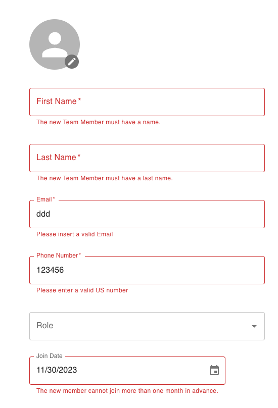
Finally, let's test our validations. Fill in the form, but leave some fields empty or with incorrect formats. When you click Submit, the validations errors will appear:
Configuring the OnSubmit Event
We are ready to submit the new user's data with the validations in place.
Now, it is time to configure the form block's OnSubmit event.
Let's go to the component's Events tab and click Edit Custom Code.
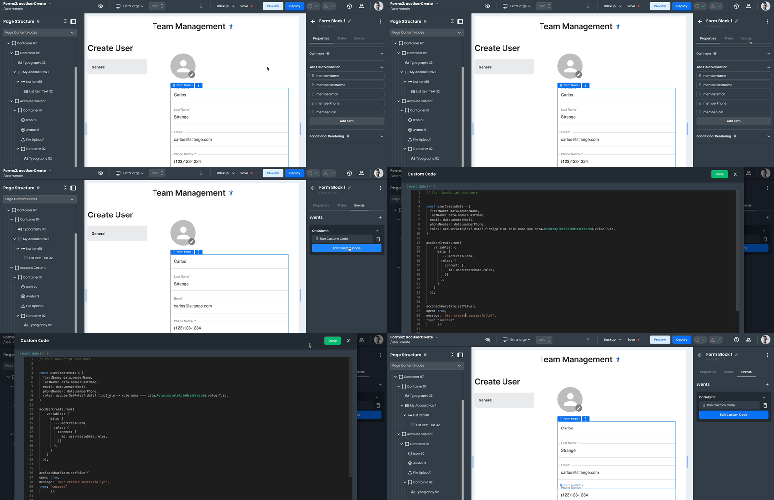
In the ensuing code example, we perform three critical steps:
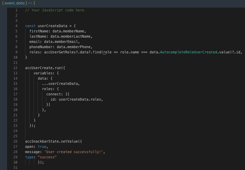
- Capture the values entered in the Form inputs.
- Execute a request to create a user, using the captured data.
- Display a confirmation message to the user, indicating successful data submission.
Upon completing these steps, click Done. This action finalizes your code edits.
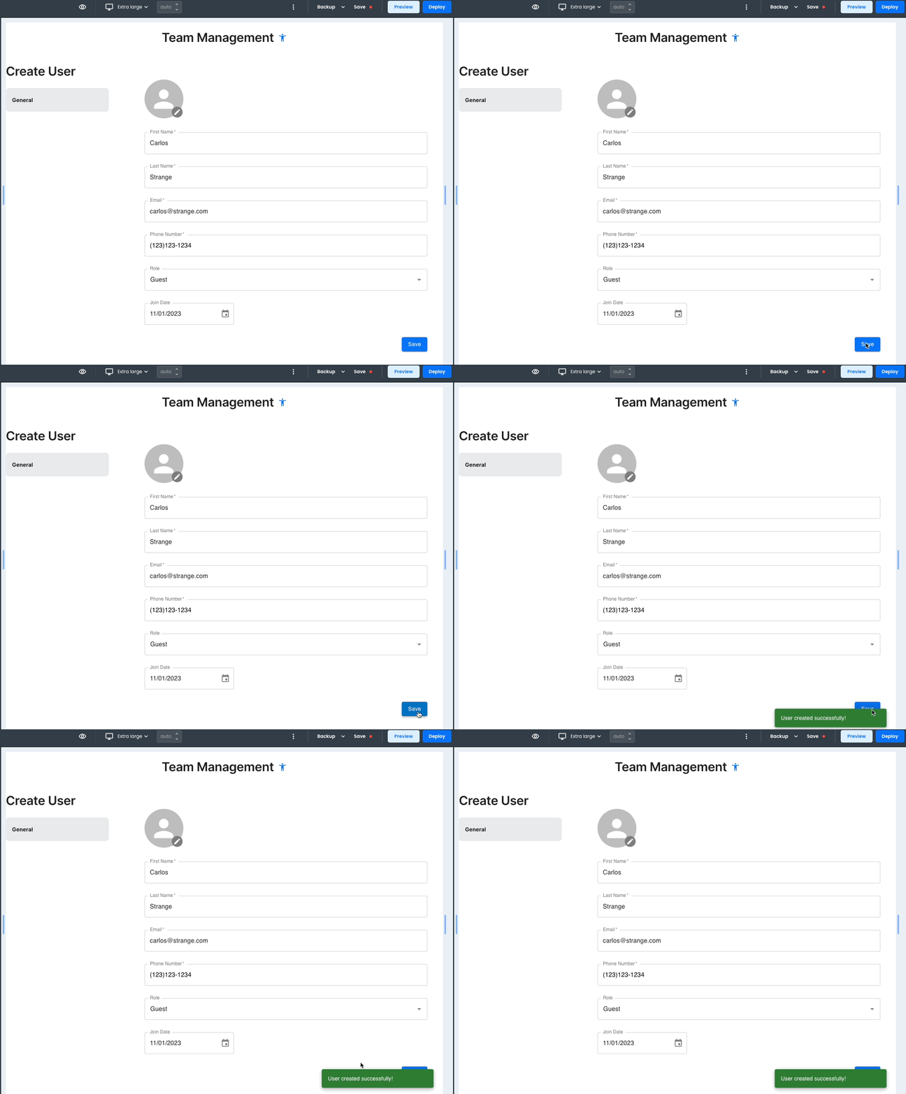
Now, you are set to execute the OnSubmit event. To do this, let’s preview our app and click on the Save button. Remember, this action triggers the submission of user data, after performing the validations.
