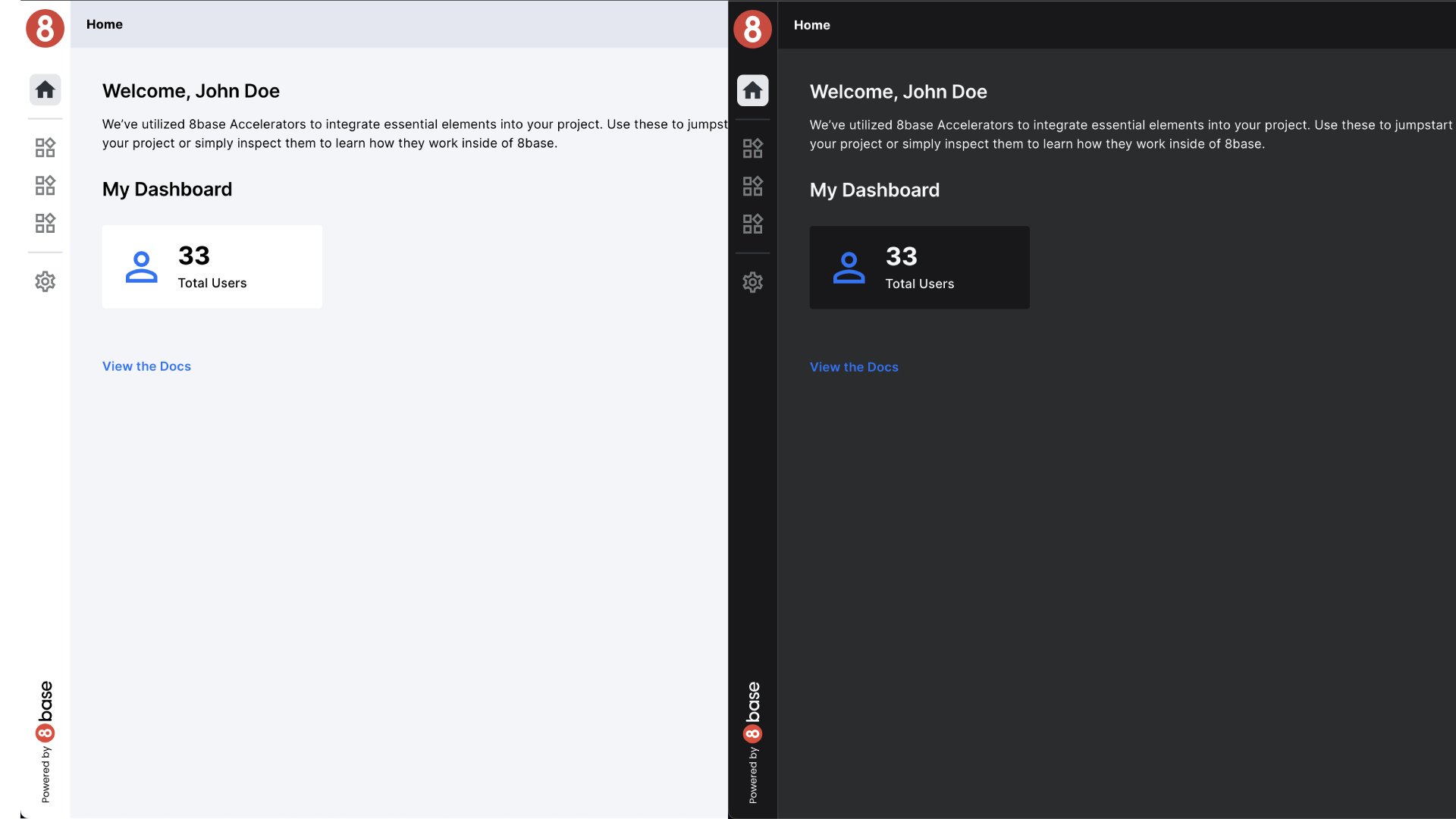
Dark Mode Support
By providing a Dark Mode implementation, your users can enjoy a personalized and comfortable viewing experience.
You can implement global custom CSS or component-specific CSS. This allows you to tailor Dark Mode Support to your application's needs. You can use one or both methods to achieve a consistent and visually pleasing Dark Mode experience for your users.
Setting Dark Mode
In your application, Dark Mode is controlled by a global state variable named accThemeMode. This variable can have one of two values: "Light" or "Dark." The selected mode affects the overall appearance of the application, making it more adaptable to varying lighting conditions and user preferences.
Dark Mode Support can be implemented in different ways, depending on your application's architecture and design choices. Here are two common approaches.
Global Custom CSS
In this approach, you create a separate CSS file specifically for Dark Mode styles. You define CSS rules within this file that apply to elements when Dark Mode is active. To distinguish Dark Mode styles, you can use a class, such as .Dark, as a parent selector for the elements you want to modify.
Example of Global CSS for Dark Mode
/* Dark Mode Styles */
.Dark .elementToModify {
  background-color: #333; /* Dark background color */
  color: #fff; /* Light text color */
}
By applying the .Dark class to the HTML body when Dark Mode is active, the specified styles will take effect, changing the appearance of elements throughout the application.
Custom CSS in Components
Alternatively, you can implement Dark Mode Support directly within your individual components. In this approach, you specify specific CSS properties to change based on the selected mode. This method provides fine-grained control over styling within each component.
Examples of Custom CSS for Components
Directly Styles
Directly styles is used to put custom and specific CSS properties in the components styles pane. You can modify things like borders, colors, backgrounds, fills, and other things that you found in the Style Pane.
{{accThemeMode.value === "Light" ? "#000" : "#fff"}}
{{`var(--mainBg${accThemeMode.value})`}}
Directly Class
In this example, the component conditionally applies a dark-mode style, class based on the accThemeMode state.
{{accThemeMode.value === "Light" ? "lightCard" : "darkCard"}}
{{`container${accThemeMode.value}`}}