Theme Customization
Theme Customization in the Theme Management Accelerator offers a robust and flexible theming system that caters to a wide range of preferences and design requirements. By enabling users to customize colors, create custom variables, and leverage Material UI theming, your application achieves a highly personalized and visually cohesive design that enhances the user experience.
Customizing themes within your application is an accessible and intuitive process.

Key Features
Powerful Theming Capabilities
The Theme Management Accelerator leverages Material UI's theming capabilities, providing users with access to a wide array of customization options. For more information, see [Material UI's Theming documentation](https://mui.com/Material UI/customization/theming/).
Customizing Primary and Secondary Colors
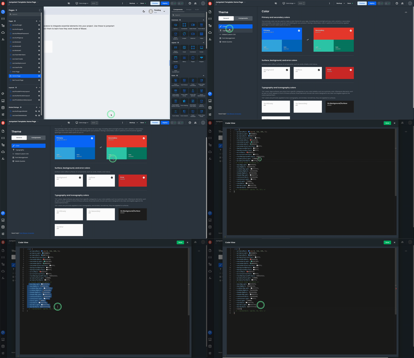
With Theme Customization, users have the ability to modify both primary and secondary color palettes. These color choices allow users to align the application's colors with their brand identity or personal taste. This level of customization ensures that the application seamlessly integrates into their visual landscape. It also means that user's can adjust the color palette to meet accessibility requirements.
Creating Custom Variables
Theme Customization enables the creation of custom variables that are accessible throughout the entire application. These variables serve as a unified design language, ensuring consistency and coherence across various UI components. Users can define custom variables that impact global custom CSS, style properties, and even custom component-specific CSS.
Overriding Default Styles
The colors and variables modified through Theme Customization take precedence over the default styles of Material UI Material components used throughout the application. This ensures that the selected theming choices propagate consistently, offering users a tailored and cohesive design language.
Benefits of Theme Customization
Personalized Branding: Users can align the application's visual style with their brand identity, creating a personalized and unique user experience.
Consistency: Custom variables and theming options provide a unified design language, ensuring visual consistency throughout the application.
Granular Control: Theme Customization empowers users with granular control over primary and secondary colors, allowing them to fine-tune their application's color palette.
Material UI Integration: The Theme Management Accelerator seamlessly integrates with Material UI, enhancing the application's theming capabilities and providing users with access to Material UI's extensive theming options.
How to Use It
Style Properties
You can use the classes that you create in your components styles such as colors, backgrounds, borders, and all properties on the Style pane when editing a component.
Simple Class
{{"var(--primaryMain)"}}
Variable Class
{{`var(--mainBg${accThemeMode.value})`}}