Binding Custom Entries to a Card
This example will demonstrate how to access data in Custom Entries for use in a Card component.
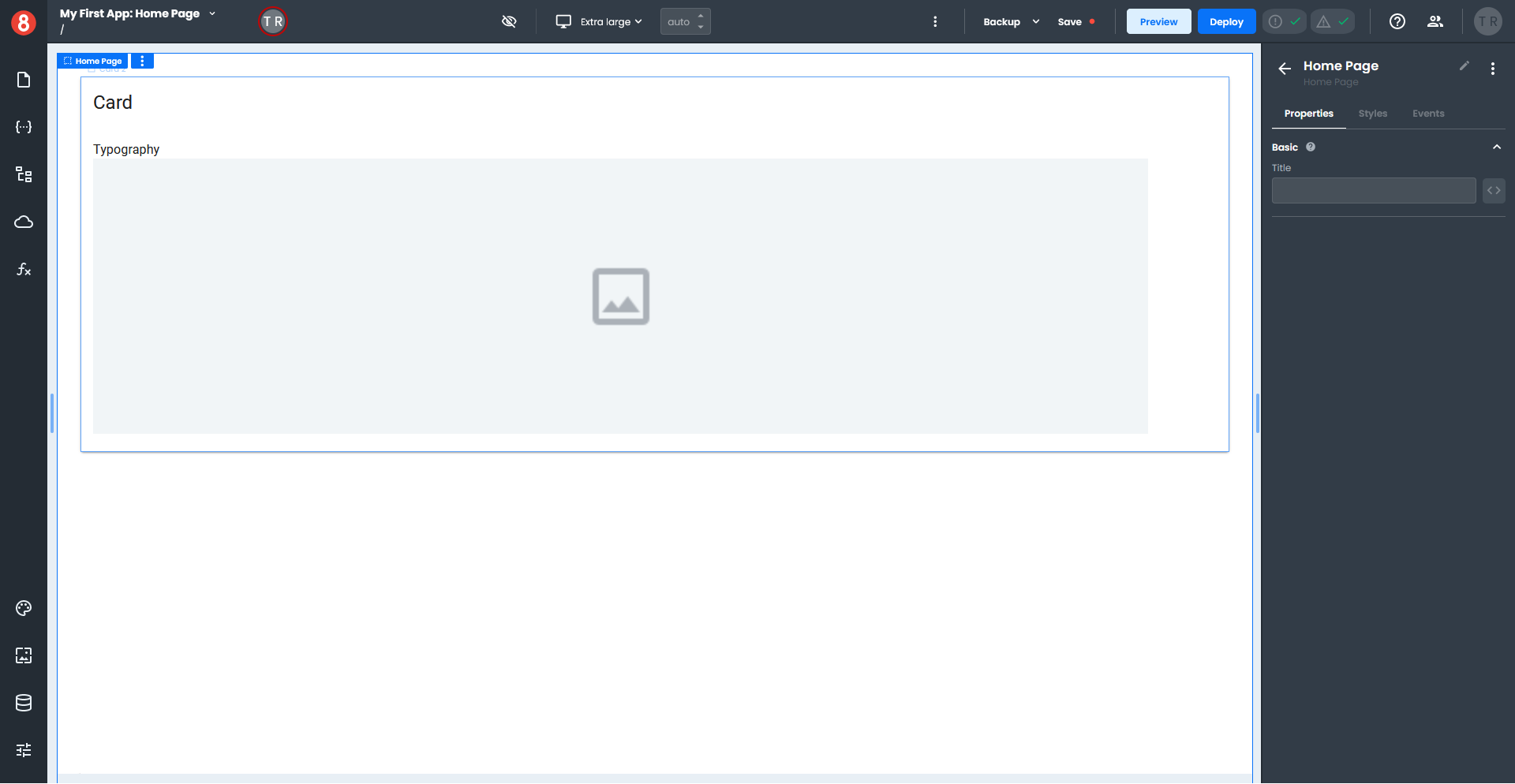
You will need a Page with no content.
- Select a Card component from the Layout section of the Components pane and drag it onto your page.
- Select a Typography component from the Common section of the Components pane and drag it onto the Card Content area of your Card component.
- Select an Image component from the Other section of the Components pane and onto the Card Content area of your Card component.
- The Typography component should be above the Image component. If not, open the Page Structure pane and adjust the components so they are in the proper order.
Your page should look like this.
Next, you will set up the data the Card component will use by creating four Custom Entries in the Local State.
- Click the State icon on the left menu and ensure the Local tab is selected.
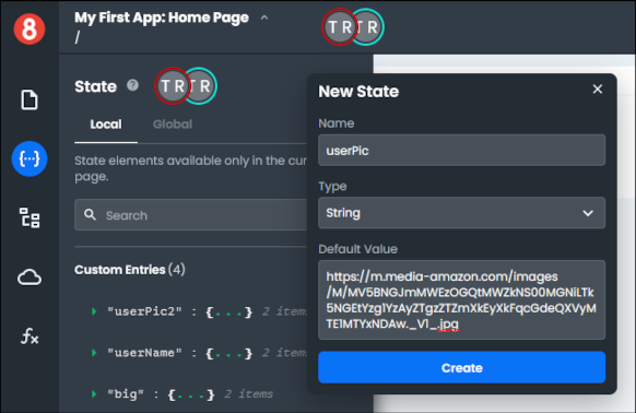
- Click the "+" at the top of the State pane to create a new State, which opens a small pop-up window.
- Enter "userPic" in the Name field, set the Type to String, and enter "https://m.media-amazon.com/_images/M/MV5BNGJmMWEzOGQtMWZkNS00MGNiLTk5NGEtYzg1YzAyZTgzZTZmXkEyXkFqcGdeQXVyMTE1MTYxNDAw._V1_.jpg" in the Default Value field.
- Click "Create".
Your first custom entry should look like this.
Let's add the remaining Custom Entries.
As before, click the "+" to add a new State, enter the values indicated for each custom entry below, and click "Create".
For the second custom entry, enter the following:
- Name - userName
- Type - String
- Default Value - John Wick
For third custom entry, enter the following:
- Name - big
- Type - String
- Deafult Value - 500
For the fourth custom entry, enter the following:
- Name - role
- Type - String
- Deafult Value - Big Boss
Now that you have all your Custom Entries set up, you will add data to the Card component.
- Select your Card component, which opens the Properties pane.
- Click the Styles tab to switch to the Styles pane and expand the Size section.
- Next to the Width field, click the three-way icon "\<>" and switch to State format.
- Select "big" from the drop-down inside the Width field, which sets the width of your Card component using your custom entry.
- Click the Properties tab to switch back to the Properties pane.
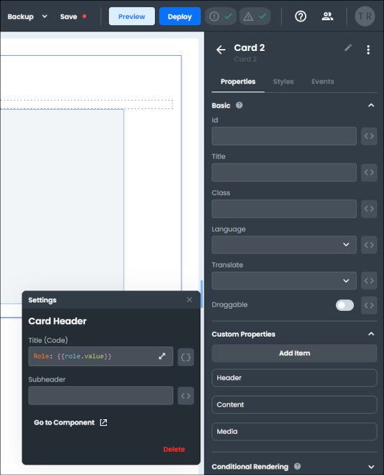
- In the Custom Properties section, click the gear icon to the right of the Header, which opens a pop-up settings window.
- Next to the Title field, click the three-way icon "\<>" and switch to the code format "{}".
- Enter
Role: {{role.value}}in the Title field. - The value of the role custom entry will appear as the title of your Card.
Next, you will add text to the Typography component to your Card from the userName custom entry.
- Select the Typography component on your Card, which opens the Properties pane.
- Next to the Text field, click the three-way icon "\<>" and switch to the State format.
- Select "userName" from the drop-down inside the Text field.
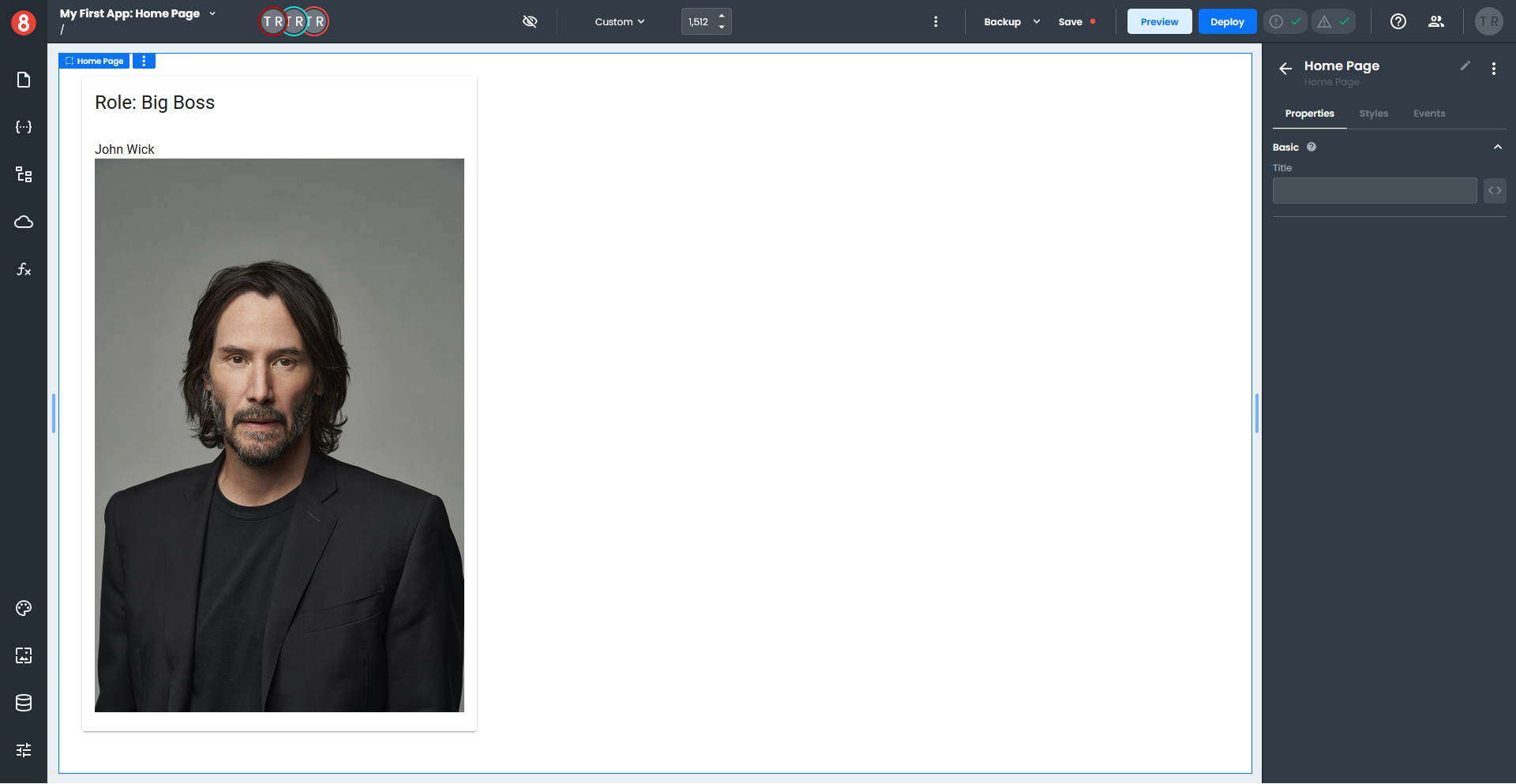
- Your Typography component should display John Wick.
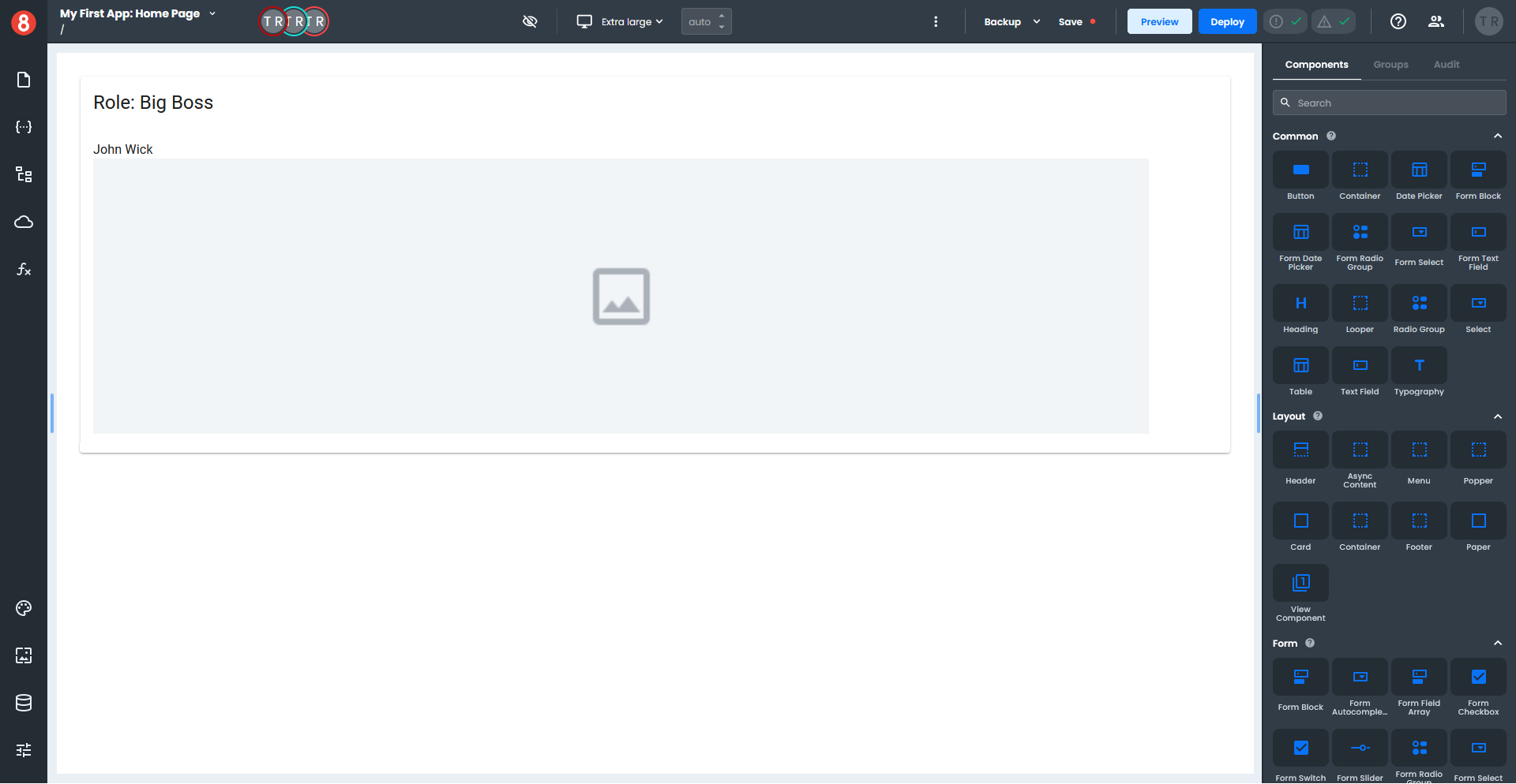
At this point your Card should look like this.
You will now add the final piece, which is setting up the image to display.
- Select the Image component on your card, which opens the Properties pane.
- Next to the Source field, click the three-way icon "\<>" and switch to the code format "{}".
- Enter
{{userPic.value}}in the Source field.
Your completed Card should look like this.