Binding a Function to a Looper
This example will demonstrate how to access data in a Function for use in a Looper component.
You will set up your Page and then build your Function so you can dynamically add data to your components.
- Select your Page on the canvas, which opens the Properties pane.
- Select the Styles tab and set the Background Color to black.
- Click the arrow next to the Page name at the top of the Styles pane to return to the Components pane.
- Select a Heading component from the Common section of the Components pane and drag it onto your page.
- Enter "Paella Recipe" into the Text field and set the drop-down in the Tag field to H1 on the Properties pane.
- Click the the Styles pane and set the drop-down in the Variant field to H1.
- Check that the Font Color is set to Initial and the Align is set to Inherit.
- Select a Looper component from the Data section of the Components pane and drag it onto your page.
- Click the Styles tab in the right-hand pane and select the grid icon under Display.
- In the Grid Template field enter 248.016px 392.016px / 258.656px 258.672px 258.672px / none.
- In the Grid Template Columns field enter 1fr 1fr 1fr.
- In the Grid Template Rows field enter 248.016px 392.016px.
- In the Grid Column Gap field enter 16px.
- In the Grid Row Gap field enter 16px.
- In the Grid Gap field enter 16px.
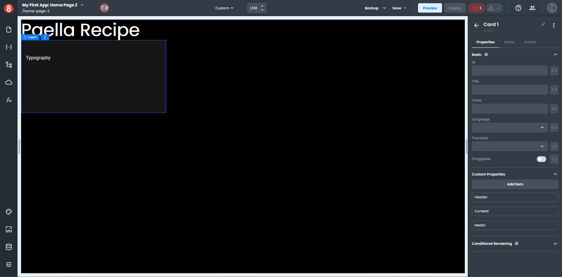
- Select a Card component from the Data section of the Components pane and drag it onto your Looper.
- Click the Styles tab in the right-hand pane and set the Background Color to
#181616. - Select a Typography component from the Common section of the Components pane and drag it onto the Card Content component.
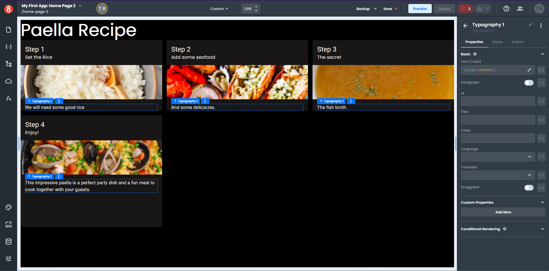
Your page should look similar to this.
It's now time to build your Function.
- Click the function icon on the left-hand menu to open the Functions pane and select the Global tab.
- Click the "+" on the top of the Functions pane to create a new Function.
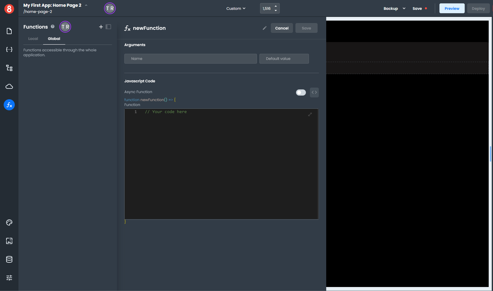
- Enter "spanishRecipe" at the top on the Functions pane where it says newFunction. This will be the name of your new function.
- Click the expand arrow in the code area of the Functions pane to open the the code panel.
- Copy and paste the following code into the code panel and click "Done".
 return [
  {
    title: 'Step',
    subheader: 'Set the Rice',
    content: 'We will need some good rice',
    media: 'https://ucarecdn.com/02ef0351-393c-46f2-a4c5-fba8bc9a2f5d/looper1.png'
  },
  {
    title: 'Step',
    subheader: 'Add some seafood',
    content: 'And some delicacies.',
    media: 'https://ucarecdn.com/9f209dae-009c-415d-ae3a-c12719318a38/looper2.png'

  },
   {
    title: 'Step',
    subheader: 'The secret',
    content: 'The fish broth.',
    media: 'https://ucarecdn.com/b79b1adf-c5ad-4c33-9ad3-8302cb6cef74/looper3.png'
  },
   {
    title: 'Step',
    subheader: 'Enjoy!',
    content: 'This impressive paella is a perfect party dish and a fun meal to cook together with your guests.',
    media: 'https://ucarecdn.com/90574ffc-3d95-47e2-8d0d-627b66d91be9/looper4.png'
  }
 ]
We will now add the Function data to the Looper component.
- Select your Looper on the Page, which opens the Properties pane.
- Enter
{{ spanishRecipe() }}in the Loop Data field and the word item in the Item Name field.
The Looper will display four blank Cards on your Page, which is how many objects are in your Function.
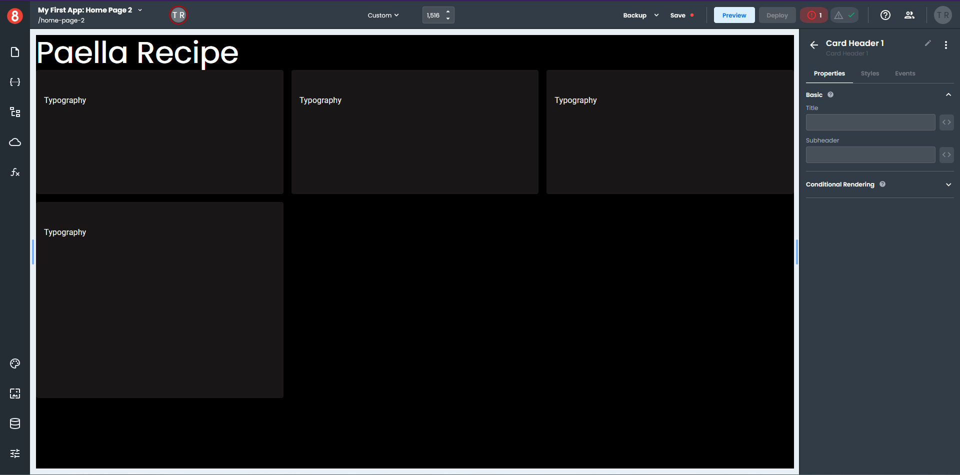
- Select your Card component, which opens the Properties pane.
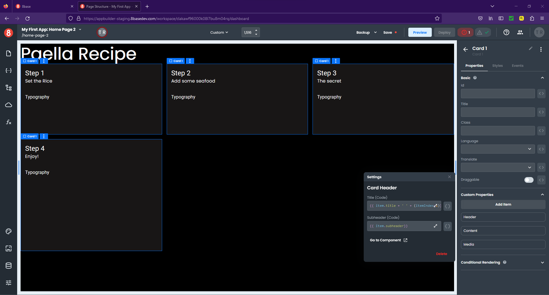
- In the Custom Properties section, click the gear icon to the right of the Header item, which opens a pop-up settings window.
- Next to the Title field, click the three-way icon "\<>" and switch to the code format "{}".
- Enter
{{ item.title + ' ' + (itemIndex+1)}}in the Title field. - Next to the Subheader field, click the three-way icon "\<>" and switch to the code format "{}".
- Enter
{{ item.subheader}}in the Subheader field and click the "x" to close the pop-out.
- Click the gear icon to the right of the Media item, which opens a pop-up settings window.
- Next to the Image field, click the three-way icon "\<>" and switch to the code format "{}".
- Enter
{{item.media}}in the Image field, set the Height to 120 px, and click "x" to close the pop-out. - Select the Typography component on any Card, which opens the Properties pane.
- Next to the Text field, click the three-way icon "\<>" and switch to the code format "{}".
- Enter
{{item.content}}in the Text field, and click "x" to close the pop-out.
Once you start adding data elements to your components you can see the data immediately on the page.
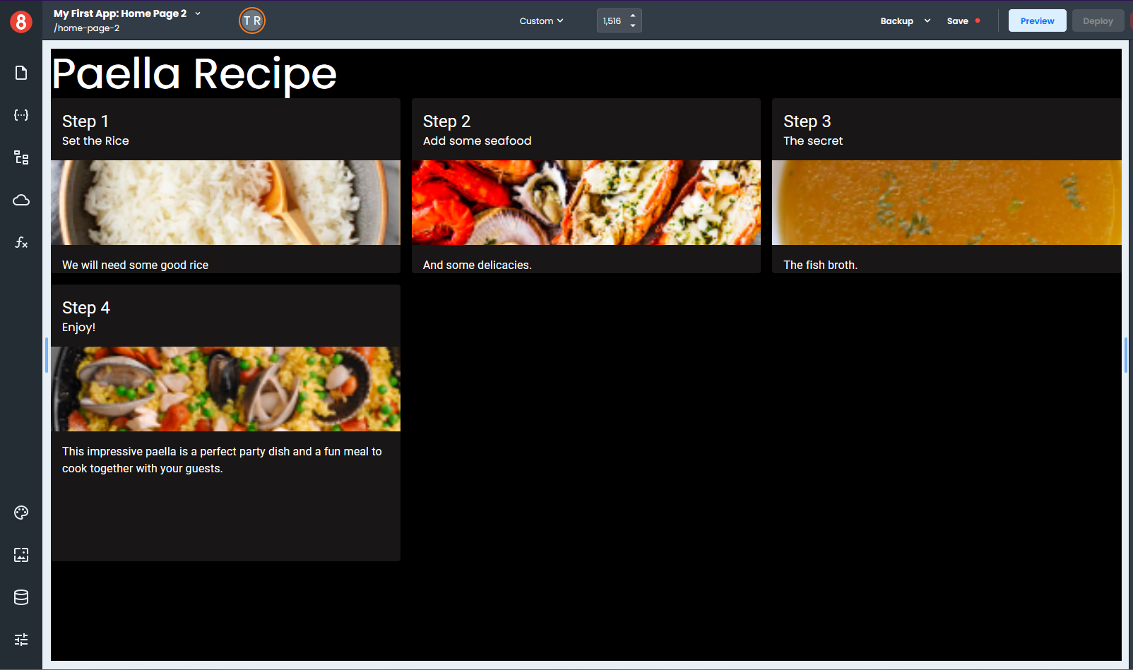
As you can, see the Looper component is an extremely powerful component for building dynamic pages.