File Drop Zone
The File Drop Zone component is a variant of the File Upload component; just like the original version, it allows users to browse and select one or more files to upload. It is used independently or as a form component within a Form Block. Additionally, this component allows the user to drag & drop files into it.
This component differs by being a container-type component rather than a file-type input. However, even though its presentation is different, under the hood, all its properties and functionality are the same as the File Upload component.
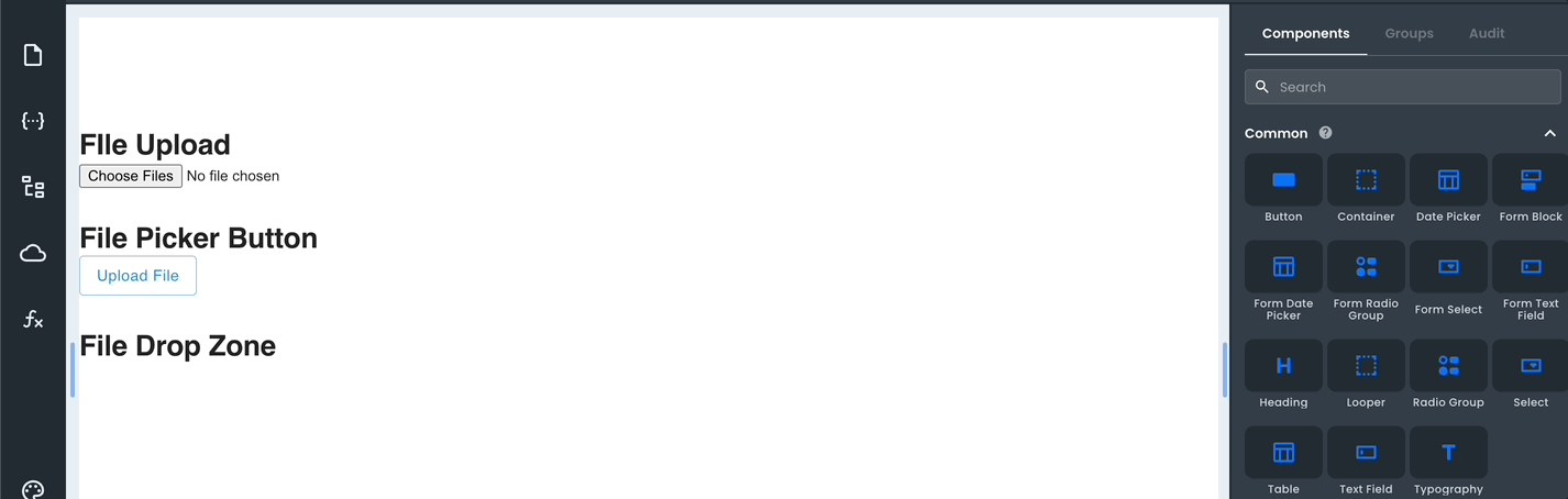
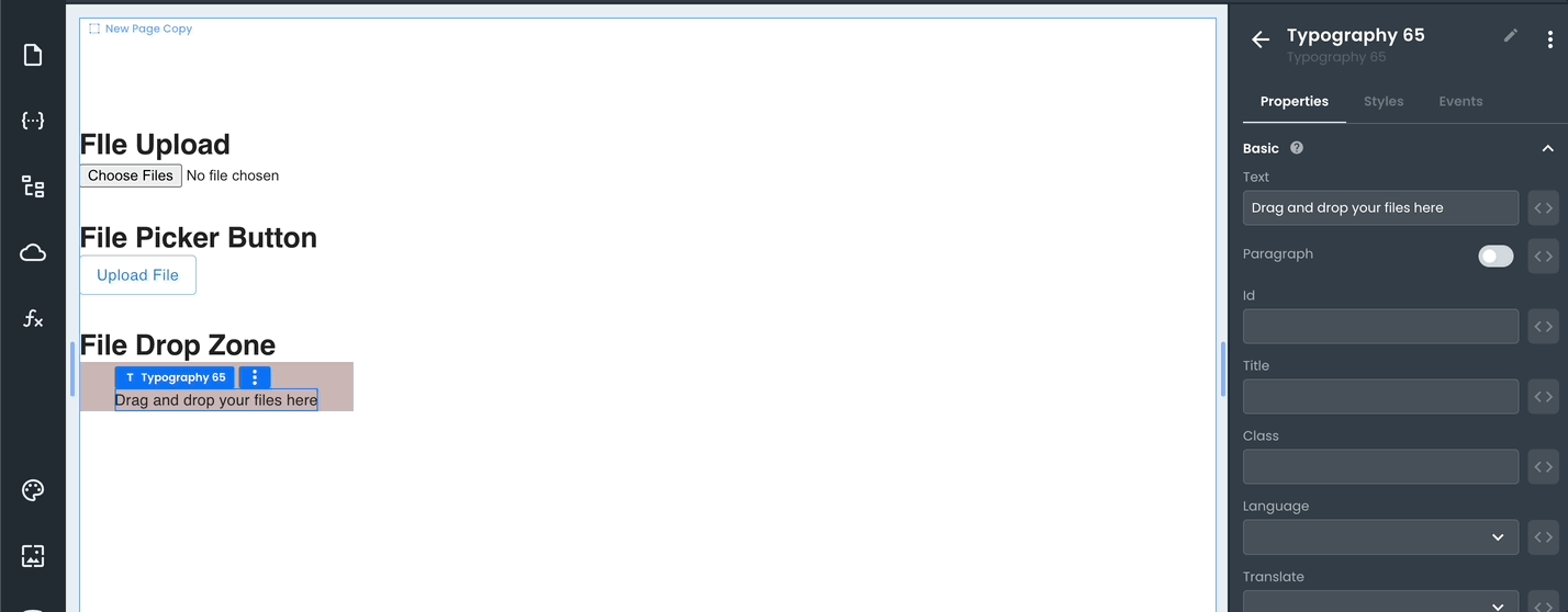
The File Drop Zone component is a container that has typography and icon components inside to give the user greater flexibility when customizing.
For example, the user can change the text "Drag & drop file here" or even the file upload icon.
The component also has Custom Properties that allow you to add additional properties using Key Value pairs.
Properties
| Name | Type | Default | Description |
|---|---|---|---|
| acceptedFiles | string | Defines a comma-separated list of allowed file types. | |
| wrongFileTypeText | string | "Wrong file type uploaded" | Defines the text in the error message to be shown when uploading a file with a different type than the one set. |
| maxFileSize | number | Defines the maximum size of a file. | |
| fileSizeExceededText | string | "Max file size exceeded (maxFileSize)" | Defines the text in the error message to be shown when uploading a file with a size larger than the one set. |
| showFileList | bool | true | If true, the list of selected files is displayed. |
Additionally, As a Container component, it also exposes the same style properties.