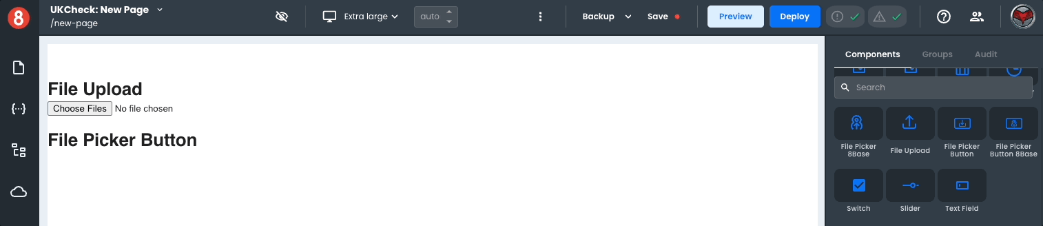
File Picker Button
The File Picker Button component is a variant of the File Upload component; just like the original version, it allows users to browse and select one or more files to upload. It is used independently or as a form component within a Form Block.
This component differs by being a button component rather than a file-type input. However, even though its presentation is different, under the hood, all its properties and functionality are the same as the File Upload component.
The component also has Custom Properties that allow you to add additional properties using Key Value pairs.
Properties
| Name | Type | Default | Description |
|---|---|---|---|
| acceptedFiles | string | Defines a comma-separated list of allowed file types. | |
| maxFileSize | number | Defines the maximum size of a file. |
Additionally, As a Button component, it also exposes the same style properties (except those in the advanced section).